Standard Life Bank…but only during office hours

Standard Life Bank’s internet banking service is useless. “Banking online gives you the flexibility to manage your account when it suits you,” they say. Well, that would often be on Saturday or Sunday evenings. Or sometimes very late on a weekday evening. Perhaps after 11pm.

Whoa there, boy! Did we say when it suits you? Whoops, we meant to say when it suits us. Sorry for the typo!

Standard Life Bank's internet site is only open during office hours

I mean, really, folks. What’s up with that? Are their servers unionized? Did they threaten walkouts if they had to be switched on 24/7? Do they all pull out their network cables at the end of the day and go home for the night?

Or maybe all of Standard Life Bank’s internet transactions get handled manually behind the scenes? Maybe there’s an army of call centre workers trained to take incoming web page requests, scribble them down on paper, and pass them along to their colleagues who work some abacus magic before approving a money transfer request. Maxwell’s Demon, eat your heart out.

Oh, and their phone banking is even worse. Not open on Sundays at all.

Welcome to the 21st century!

Dutch train station clocks

Dutch train station clocks have always baffled me. They are, I am sure, the strangest timepieces known to mankind.

They’re visually quite distinctive, in an Ur-clock kind of way. They have plain, backlit white faces inside a black box with rounded corners. The hands are thick, and the minute divisions are chunky. They make the time very readable even from large distances.

But their visual apperance isn’t the strange thing about them. It’s their behaviour. Click on the image below for a video clip (about 1.6MB) of one of these clocks in action. I haven’t doctored this clip in any way. Pay close attention to what happens when the second hand passes the minute mark.

A Dutch train station clock

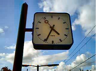
Tick…tick…tick…PAUSE…PAUSE…PAUSE…tick…tick. The second hand pauses for about three second at the top of the minute. Why? It means that the second hand makes a full cycle in 57 seconds, rather than 60. Each beat of the second hand is only 0.95 seconds long. By design, these clocks can only ever show the right time once every minute. The rest of the time, they are GUARANTEED to be wrong.

Okay, so they’re only ever fractionally out, but…but… it’s just wrong. It’s the kind of thing that can drive a person just ever so slightly mad…in 0.05 second increments.

This behaviour must be by design; it’s too strange to be an accident, and the clocks would have been fixed long ago if it was. So there has to be a good explanation for it.

Could it be a subconscious nudge to make people hurry up for their trains, by making them think that it’s slightly later than it actually is? Is it a subtle technique to help people relax in a tense rush hour environment, by giving them a three-second breathing space at the top of every minute? Are there any readability benefits from having the second hand pause like this?

There must be a reason. Does anyone know what it is?

(Amusing speculations are also welcome.)

Minor strangulation incident; nothing too serious

Abi came home this evening with the kids in tow, and explained that there had been an “incident” at nursery today. Alex had been playing on the slide in the nursery’s back garden, and somehow got tangled up with a skipping rope….

Anyway, the doctor said he’ll be fine, and I’m sure the ligature marks around his neck will fade eventually.

(Extra note: and all this less than a week after the Haltwhistle Exploding Nose incident. Alex isn’t havening a very good month so far.)

Progressive disclosure, social networking, yada yada

Gah… I’d been talking to a colleague about the idea of progressive disclosure just last week, but I had forgotten the term for it. The concept had somehow stuck in my head as “progressive obligation,” and when I googled for the term I was coming up with zilch. (Or at least, nothing related to HCI and usability.)

I bumped into the correct term this morning while I was reading the article Progressive Trust on Christopher Allen’s A Life With Alacrity blog. I had got to Christopher’s blog index page from his entries on Orkut from earlier this year ([1], [2], [3]), which I had found while I was googling around for some information about Orkut and email.

And the reason for that was that I got my first invitation to Orkut last month. Or maybe it was just the first one to make it through my spam filter. When I signed up, there were two other people who had listed me as friends already. Normally, when you add a friend who isn’t a member of Orkut, the system should send them an email inviting them to join.

But now I’m wondering if the invitation I received was the first one Orkut had sent me at all, because in the last month or so I’ve discovered that its email delivery mechanism is almost entirely random. Will it send a notification 12 hours, 24 hours, or even three days after the fact? Who can tell…with the Mail Server of Mystery!

Speed, or the lack of it, is the main issue I have with Orkut. I have been using it mostly in the evenings (UK time), and the page response times I get are rarely less than half a minute. Guys, even ten seconds is too slow for a usable web interface. Thirty is rubbish, and it’s decidedly un-Google-like. (Like I have the patience to wait around half a minute for a bulletin board posting. Hello NADD! I’ve joined a few Orkut groups, but mostly with the goal of painting my profile with personal interest metadata, rather than for actually participating in the communities.)

The authentication system they use is also flaky. Far too regularly it dumps me out to the “You haven’t used the system for thirty minutes, so we’ve timed out your session; it’s for your own good, you know” screen, even when my last page hit was about two minutes before. That’s usually the point at which I give up.

Because of these factors, for me Orkut is reduced to a collection of glorified home pages. Sure, I can see how all of these people are connected to me, but only within the context of Orkut itself. Friendster, LinkedIn, and all the others are dark to me. It’s like the bad old days when proprietary networks like Compuserve and AOL allowed their members to send email to each other, but not to the outside world. Or like when you couldn’t use MSN Messenger to send a message to someone on AIM. Oh wait…that would be now.

This whole social networking thing is going to be big, but it’s not going to explode until the various services find a way of interoperating. Metcalfe’s Law is in the house, homies, and it’s party time. Your social network shouldn’t be a function of your service provider. You can make people work that way for a while, but eventually the network is going to win.

Rosenberger Image Replacement

I’ve been playing around with Stewart Rosenberger’s excellent Dynamic Text Replacement technique lately. It’s a simple and elegant technique, and it works beautifully well with TrueType fonts. It gets a little bit more tricky if you want to use PostScript fonts, though. On the ALA discussion, Stewart says that “you could change the PHP script to use PS fonts very easily”. Well….

  • It’s not as simple as replacing the ImageTTFBBox and ImageTTFText calls with their PostScript counterparts ImagePSBBox and ImagePSText. The PS versions take different parmeters in a different order, and they return a different results array. Read the documentation carefully.
  • …and you’ll need to explicitly load the PostScript font before using it, and dispose of it when you’re done.
  • …and once you’ve done all that work, you need to make sure that your web host has compiled PHP with support for Type 1 PostScript fonts, using the --with-t1lib option, because otherwise you’ll get nothing but errors when you try to deploy.

Nuts. Maybe I should have checked that last step first.

If you have access to a copy of Windows NT4 (how quaint!), you can convert a Type 1 font into a TrueType font by dragging it into the Windows\Fonts folder. (NT generates a .ttf font because it doesn’t have native PS support. Later versions of Windows do have native support, and so they don’t do the conversion when you install a PS font.) The quality of the generated TrueType font leaves a lot to be desired, however, and even aside from the licensing issues, I wouldn’t consider it as a source for Dynamic Text Replacement.

So what next? Well, I could rewrite Stewart’s script to use ImageMagick for generating the images. Alternatively, I could try Shaun Inman’s Flash Replacement technique. (I’d prefer to stick with images instead of Flash, though. The text isn’t selectable, and you end up with a bigger download, but images are faster to render, have fewer flickering issues, and fewer cross-browser/standards niggles.) Or I could splash out and buy a TrueType version of the font I want to use. Or…I could just use a font I already have in TrueType format. Such a wealth of choice!

I think I’ll be taking the easy, cheap option.

Update (Thu 8 Sept 2004)

Mike Davidson’s Scalable Inman Flash Replacement technique (sIFR) is looking like a glorious alternative.