<fieldset> and <section> elements can both
be used to break up a large whole (a form or a document) into smaller,
logically grouped chunks. Semantically, a <section> element is very flexible,
but a <fieldset> is much more restrictive. Although you can put a <hn>
element somewhere inside its body to give it a title, the proper way to indicate the caption of a fieldset is to use
a <legend>. This is where the problems come in, because <legend>
is a pain in the arse to style.
For a start, browsers refuse to style a <legend> as a block, which means that you can’t
easily apply a background and border that stretches across the whole width of the <fieldset>
it is captioning. Secondly, browsers have a set of special non-overrideable positioning rules for <legend>
that are designed to make it float in the middle of the border around the <fieldset> — see below.

Furthermore, you can’t just wrap the <legend> in a <header>, because
the spec says that the
<legend> has to be the first child element of the <fieldset>.
Oh, and you can’t just put a block-level <header> inside the <legend>
either, because a <legend> may only contain phrasing content.
(You can put a <span> in there and then apply display:block to the span; this is a significant part of the workaround. But you have to be careful with positioning the element when its content wraps over multiple lines.)
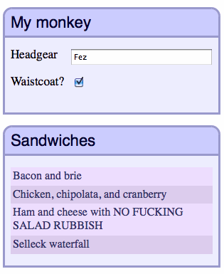
The reason I’m looking for a workaround in the first place is this: I’ve got an application
where edit screens are divided up into chunks, some of which contain groups of fields,
and some of which contain lists. Their HTML content is different, but visually I want their blocks
to be styled essentially the same way — see image below.
Additional requirements:
- Insofar as possible, I want the
<fieldset>and<section>
to share a common set of modular classes, so that I don’t have to maintain two completely
different sets of styles. - Mobile devices have narrow screens, but some sections have long captions; captions longer than can fit
on a single line should break nicely across multiple lines. (Some<legend>formatting examples on
the interwebs rely on re-positioning the caption, but don’t take multi-line captions into account.) - When CSS is disabled, the naked HTML should be comprehensible because of the appropriate use of
standard semantics: a fieldset is a fieldset, a section is a section. No silly tricks. - No JavaScript, with the exception of the HTML5 shim to make IE<9 behave.
Here’s the HTML structure I’m happy with:
HTML for a <section>:
<section class="chunk">
    <header class="hd">
        <h1 class="text">Caption text</h1>
    </header>
    <div class="bd">
        <ol class="list">
            ...
        </ol>
    </div>
</section>
HTML for a <fieldset>:
<section class="chunk">
    <fieldset>
        <legend class="hd">
            <span class="text">Caption</span>
        </legend>
        <div class="bd">
            <ol class="fields">
                ...
            </ol>
        </div>
    </fieldset>
</section>
Key points to note:
- A
<fieldset>is actually wrapped inside a<section>.
Semantically, this is unnecessary, but it makes consistent styling easier. The outermost
<section>provides a consistent container block context, side-stepping any
un-overrideable browser default styles for the<fieldset>element.
The semantic duplication is something I can live with. Vasilis points out that a<div>element wrapper might be better than a<section>, because it is semantically neutral. The CSS styling would be exactly the same; I chose<section>because it makes the HTML structures as similar as possible. - The inner content is split into header and body content, identified by elements with the class
names “hd” and “bd”. - For the fieldset case, the .hd element is the
<legend>element,
whereas for the section case, .hd is a<header>. In both cases, the .hd class
is attached to an element that semantically represents a caption for its logical block. - The actual text of the caption is wrapped in an element with a “.text” classname
rather than just being simple inner content of the caption. This is because we need to hang
some extra styling on an inner element of the .hd element. (For a<section>,
the .text element is an<h1>element, because a<header>
deserves an actual heading element inside it.)
Here’s the key CSS:
.chunk {
    background:#ccf;
    border:0.2em solid #99c;
    border-top-left-radius:0.8em;
    border-top-right-radius:0.8em;
    display:block;
    margin-bottom:2em;
    overflow:hidden;
    position:relative;
}
.chunk fieldset,
.chunk legend {
    border:none;
    margin:0;
    padding:0;
}
    .chunk .hd {
        display:block;
        padding:0.5em 0 0.3em;
        width:100%; /* For IE8 */
    }
        .chunk .hd .text {
            color:#003;
            font-family:helvetica,arial;
            font-size:138.5%;
            font-weight:normal;
            margin:0 0.5em;
            white-space:normal;
            display:block;zoom:1; /* For IE7 */
        }
    .chunk .bd {
        background: #eef;
        border-top:0.2em solid #99c;
        padding:1em 0.5em;
    }
Key points:
- There is a single border around the whole section; the line separating the header from the body
is a top border on the div.bd element. - For fieldsets and legends, we zap any default margins and padding
- The header’s background colour is actually the background of the entire section. This is
to ensure that the visual header always occupies the full width of the section. If you want a fancier
background for the header (a gradient or an image), you obviously have to apply it to the whole section. - The body’s background is applied on the div.bd element.
- The font styling for the header is applied on the .text element. Pay particular attention to the
white-space:normal rule, because this is what allows the text to wrap when it’s inside a<header> - There are a couple of IE7/8 hacks — these ensure that long text wraps onto multiple lines in those browsers. (I’m
not even going to fire up a VM to experiment with IE6.) The caption is pushed a little too far to the right in IE7,
but I’m not too worried about that; some more IE7-specific CSS could probably fix it easily, but I wanted to keep the
example CSS to the point.
Have a look at the demo page to see what it looks like for real.
I’m not going to go into much detail about the inner structure of the body of these blocks —
keeping form content semantic and pretty
is way beyond the scope of this article, and there is much more good information available on this topic
available on the interwebs than there is for <fieldset> and <legend>.
Have a look at the source code of the demo page if you want to see how I’m doing things there.