A responsive experience begins on the server…

…But it doesn’t end there.

On MobiForge a few weeks ago, Ronan Cremin pointed out that most top sites use some form of server-side detection to send different HTML to different devices. In a follow-up article, he takes Google as a specific example to show just how widely its content varies between an iPhone, a BlackBerry Curve, and a Nokia 6300.

I’m not arguing against server-side detection, and sending different content to different devices. I think it’s an essential part of an adaptation strategy. But I just want to quickly point out a few reasons why it’s not enough in order to cover the whole spectrum of browsers. Here are a few things that you won’t know when a browser makes its first request to your web server:

  • The height and width of the viewport being used. (Including the device’s portrait/landscape orientation.) If you detect a mobile device, you will be able to look up the device’s “standard” dimensions in a device database, but the user’s actual viewport may be different. If you place a web app on your iPhone’s home screen, and run it without browser chrome, it will send the same user-agent string as when it is running in a browser with chrome (thus reducing the available height). The user may be viewing your site in a browser panel embedded in a separate app, which may present a different viewport. As Stephanie Rieger explained in “Viewports all the way down…“, anyone can create embed a web view of arbitrary size in a home-made ebook.
  • The zoom level. Lyza Gardner wrote about how zoom levels and different text sizes can mess up pixel-based responsive layouts. A user-agent string contains no information about whether a user has changed the default font size in their browser. It does happen, and probably more often than you think.

  • Whether the user has cookies, and/or JavaScript enabled. I mentioned some of the reasons people disable JavaScript last year. I think that on mobile devices, which are commonly bandwidth-capped and/or rate-limited, people have a greater than normal incentive to disable JavaScript. (I don’t have any statistics to back this up, though; it’s just a feeling.) Lack of JavaScript can play havoc with some client-side detection techniques. (And lack of cookies will trip you up in many more ways; treat that as a general personalization problem.)

Basically, just because the user-agent string says “iPhone” doesn’t automatically mean you’re dealing with 320 x 480. Server-side detection alone will not give you the full picture, and only doing adaptation client-side robs you of the opportunity to perform really useful server-side optimizations. The best approach is a blend of the two, as Luke Wroblewski describes in “RESS: Responsive Design + Server Side Components“.

RESS is MORE.

Further reading:

Uploading photos from iPhoto (11) to Flickr

I used to use the Flickr Uploadr tool a lot to upload photos to Flickr, but over the last year or so I’ve found myself doing it less and less — even to the point of wondering if I should keep up my Flickr Pro membership. I think this was because I started using iPhoto. I don’t used iPhoto a lot, but adding one more tool to my photo workflow was enough to make the act of working with photos a burden.

Before iPhoto, my workflow was:

  1. Copy photos from camera memory card onto my computer
  2. Rename folders & organize photos into archive structure
  3. Use Flickr Uploadr to upload photos from hard disk to Flickr, setting correct rotation, photo set and tags
  4. Go to Flickr to add photos to the map. Maybe add some titles manually.

iPhoto never simplified these steps for me. It only added to them:

  1. Import photos into iPhoto
  2. Use iPhoto to organize photos into events, and set the correct rotation. Maybe add some titles manually.

Over time, I drifted into the habit of only placing photos into my own archive and importing them into iPhoto, and skipping the steps of uploading to Flickr. Flickr is not a bad tool by any means, but rotating and sorting in iPhoto is much faster and more immediately rewarding. The extra effort of doing all this again for Flickr put me off doing it at all.

However, at some point in the past, I must have noticed that iPhoto allows you to connect a Flickr account. (Go to iPhoto → Preferences → Accounts, and you’ll see the option to add Flickr, Facebook, MobileMe, and Email accounts. Selecting Flickr will take you to the Flickr website, where you can authorise iPhoto to post photos to your stream on your behalf.) I just didn’t do anything with this option until yesterday, when I discovered the “share” button in the bottom right corner of iPhoto:

From here, you can add the selected photos to an existing Flickr set or create a new one. You can set the usual privacy options, and you can choose whether to upload a scaled-down image or the full version.

This means that I can organize all of my photos in iPhoto, rotate them, name them, add descriptions, set a map location, etc.; and then push them up to Flickr at the press of a button. No added effort. Awesome. This is a workflow I can live with.

Vertical alignment of child and parent

Which are the blog entries I will enjoy looking back on most in ten years’ time: the hard-core techie ramblings about irrelevant ancient technical obscurities, or the personal musings that give insight into where my heart was at?

Thought so.

I don’t remember when I got to be as tall as my mum, but Alex is getting pretty close now. This photo is from last week (21 March 2012). Alex will be 11 in just a couple of weeks.

Outdenting properties for debug CSS

Whenever I’m tinkering with CSS for experimental or debugging purposes, I usually end up adding a ton of properties to help me figure out how things fit together: weird background colours, borders, alternate fonts, etc. I don’t want to leave these properties in place when I put the CSS live, though. To mark a CSS property as a temporary/debug property, I outdent it, putting it at column 0 in the file:

.monkey{
    position:absolute;
    height:200px;
    width:300px;
    top:20px;
    left:20px;
    background:url(/images/monkey.jpg) no-repeat;
border:2px solid green;
    z-index:10;
}

If you diff your code and review your changes before you commit to your version control system (you do use a VCS, don’t you?), it’s often easy enough to spot a debug property, and fix it before you actually check it in. But sometimes the changes are subtle, and they slip through anyway. By outdenting properties, they remain visually obvious in your code even after accidentally pushing them to production.

Sometimes adding a property isn’t the right debugging technique. Sometimes you want to override a property instead — and set yourself a reminder to change it back when you’re done. Because later property values overrides earlier ones, this technique works just as well:

.fez{
    position:absolute;
    height:200px;
    width:300px;
    top:20px;
top:100px;
    left:20px;
    background:url(/images/fez.jpg) no-repeat;
    z-index:10;
}

You can do the same by commenting out the original property, of course, but I find the outdenting technique faster to clean up afterwards.

Goldilocks and the Three Device Pixel Ratios

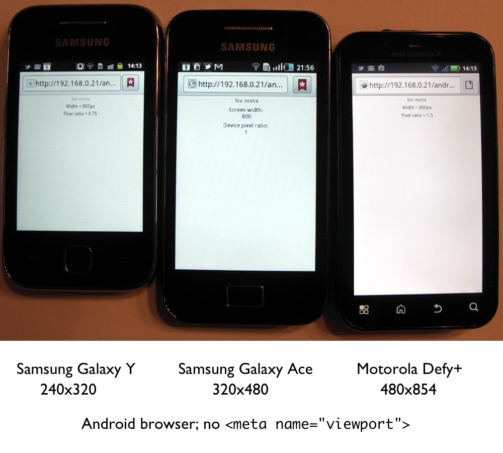
By default, your typical mobile browser (Mobile Safari, Android browser) will pretend to have a “desktop-sized” viewport when it renders a web page. The web page will appear zoomed-out and tiny, and you’ll have to zoom in to read most of the text. The photo below shows three Android devices side-by-side, rendering a plain web page, so you can compare what they look like. From left to right, the devices are:

  1. Samsung Galaxy Y running Android 2.3. Screen size: 240px x 320px; physically 4.5cm x 6cm (~135 pixels/inch)
  2. Samsung Galaxy Ace running Android 2.2. Screen size: 320px x 480px; physically 4.9cm x 7.8cm (~166 pixels/inch)
  3. Motorola Defy+ running Android 2.3. Screen size: 480px x 854px; physically 4.5cm x 8.1cm (~271 pixels/inch)

As expected, the page is zoomed out, and the JavaScript I use to read the screen width reports 800px.

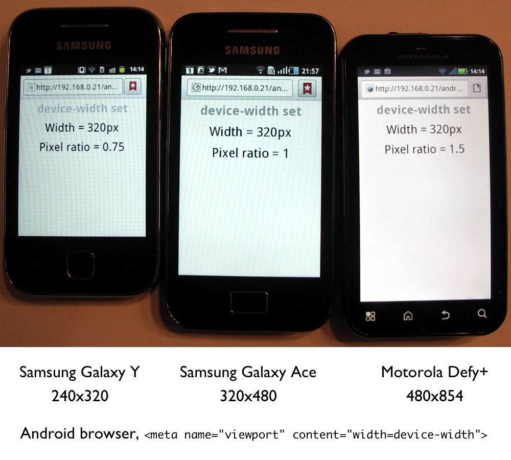
If you are building for mobile, you probably don’t want this. You can use the viewport meta tag in the head of your document to tell the browser to render at the actual width of the device.

<meta name="viewport" content="width=device-width">

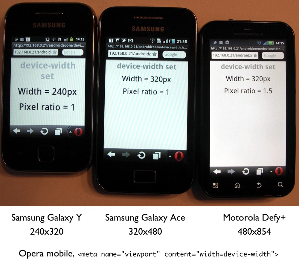
The photo below shows the Android browser rendering a page with this meta tag:

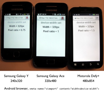
Wait, what? They all show a screen width of 320px? Don’t those three devices all have different screen sizes? Shouldn’t they go 240px, 320px, 480px? I paid for a high-resolution 480x854px phone, damn it; where are my pixels?!

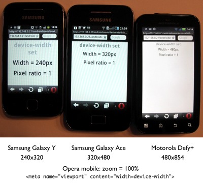
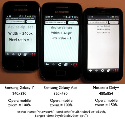
Let’s have a look in Opera Mobile:

240px, 320px, 320px. O-kaaaay…

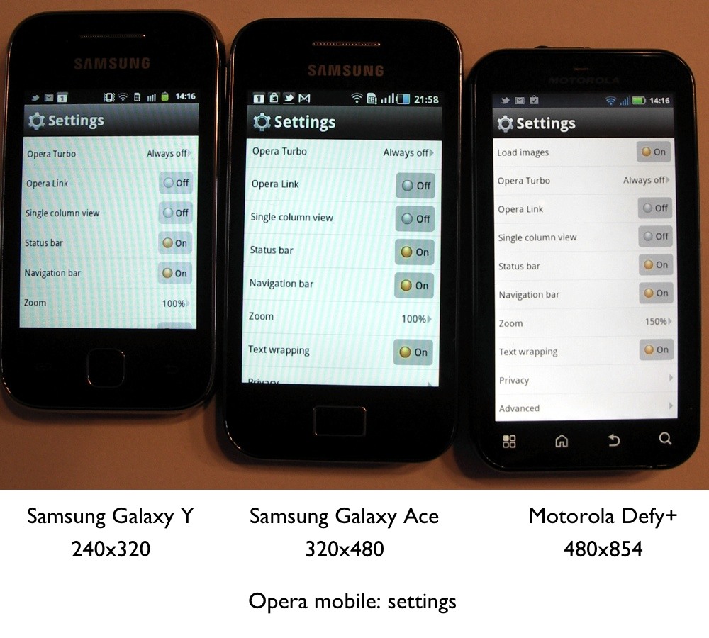
What’s going on is that the device/browser manufacturers are trying to be helpful. The screen of the Defy+ phone is physically narrower than the Galaxy Ace, but it squeezes more pixels into each square inch of the display. Using one device pixel for each CSS pixel of a 480px-wide layout on a 4.5cm-wide screen would result in some very small text. So there is a zoom factor to adjust the way the page is rendered. In Opera Mobile, you can see (and change) the zoom factor by going to Settings → Zoom. The picture below shows the zoom zettings on these three phones:

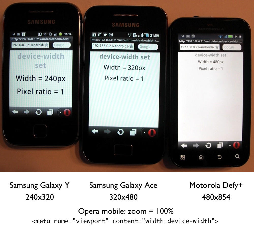
You can see that on the third device, the zoom level is set to 150%, which is how 480px gets turned into 320px. If I set that to 100%, then the results are as expected:

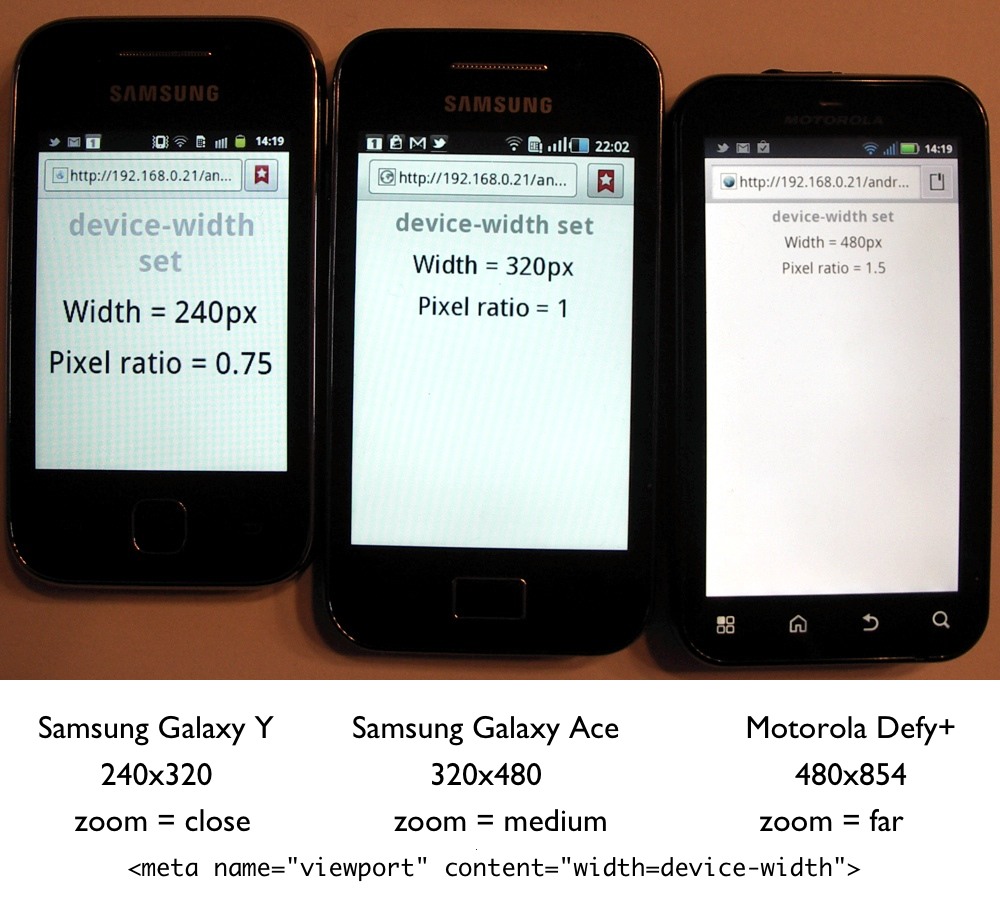
The stock Android browser has a similar setting, found under Menu → More → Settings → Default zoom. In the Android browser your choices are limited to “Close”, “Medium”, and “Far”.

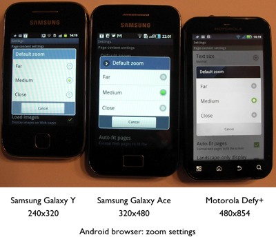
By default, all of the Android browsers had their zoom set to “Medium”. By setting the first device to “Close”, and the third device to “Far”, I can persuade the devices to render at their natural hardware resolution.

This doesn’t actually help me as a web developer, though, because I can’t force a user to change their browser settings.

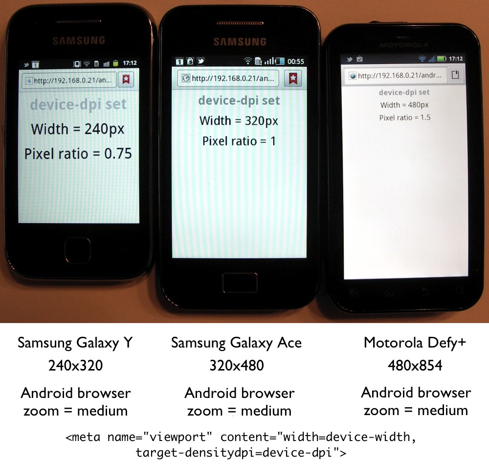
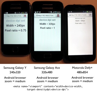
This is where the target-densitydpi=device-dpi viewport setting comes in. With this setting, you can indicate that you want a specific page to render at the device’s native hardware resolution:

<meta name="viewport" content="width=device-width, target-densitydpi=device-dpi">

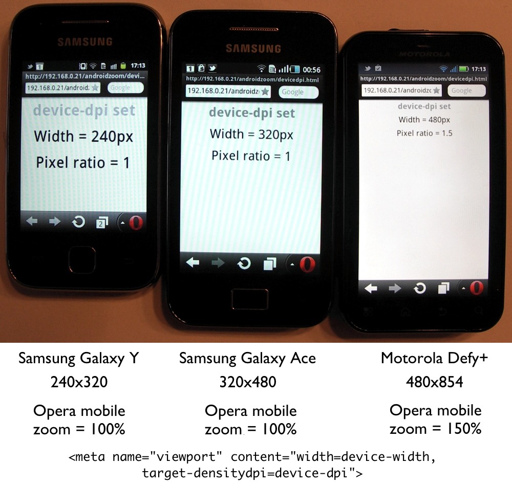
If I set all the android browsers back to the default “Medium” zoom, and set the zoom on Opera Mobile back to 150% for the Defy+, then I get the following results when I view a page with the target-densityspi property set:

Looking back at all these photos, you can see that the test pages show a second value, pixel ratio, which comes from window.devicePixelRatio. This should (I think) tell you how many device pixels go into a CSS pixel. For example, if the screen width is 320px, and window.devicePixelRatio reports 1.5, then the device is actually using 480 hardware pixels to render the 320px-wide layout. This means you’re working with a high-resolution display, so text will be crisper, and you can use high-resolution versions of images.

But although this works as expected in Opera Mobile, the Android browser seems to always report the default value for window.devicePixelRatio no matter what the actual value is on the page, as specified either by the user’s zoom setting, or forced by the target-densitydpi=device-dpi property in the viewport meta tag. Android browser on the Defy+ keeps reporting a value of 1.5 even when it is using a 1:1 pixel mapping, and the Galaxy Y keeps reporting 0.75. Likewise, min-device-pixel-ratio media queries are triggered from these default values, not from the active pixel ratios. This might be a problem when it comes to loading different versions of image assets.

I don’t recommend using this target-densitydpi viewport setting in real life. It may be tempting to force a 1:1 pixel mapping so that you can deliver wider layouts to high-resolution devices, but a typical 480px-wide layout looks uncomfortably small on a 4.5cm-wide screen. The point of high-resolution screens on mobile devices is to make the content look sharper at the same physical dimensions, not to keep squeezing more and more content into that space. I’m pretty sure that’s why Mobile Safari on iOS does not support this property in the viewport meta tag at all.

At the other end of the scale, there are plenty of low-resolution devices out there that use a devicePixelRatio of less than 1 to make their small viewports appear wider. The inexpensive Samsung Galaxy Y is a great example. It has a screen width of 240px, but pretends to be 320px wide by rendering 4 CSS pixels are across every 3 hardware pixels. This makes 320px-wide layouts look a bit blurry, but that’s better than breaking; many sites consider 320px as their mobile baseline (hello, iPhone), and ignore smaller viewports.

(Aside: “Nobody really uses a 240×320 screen” is the 2012 version of “nobody really browses the web on their phone.” Actually, yes they do. But because of this pixel scale factor, you might not notice them in your analytics.)

Basically, don’t set target-densitydpi unless you really know what you’re doing, and are prepared to consider the actual physical dimensions of your CSS pixels, which means testing on a lot of devices. Otherwise, trust the mobile browser to render those CSS pixels at a size that is comfortable for most users. If the user wants more control, the browser zoom setting is just a couple of taps away.

Test pages

Further reading

Devices, devices, devices

Before I start on my own thing, let me first point you to what Brad Frost and Stephanie Rieger have already written on the subject of building a device library:

Without wanting to get into the debate over “sites” and “apps”, I think the distinction has some bearing on how you choose to spend your money in building a device library. Here’s how:

  • Site-like, or document-oriented web projects generally align with a 100% compatibility strategy: you want your content to render acceptably and be at least minimally usable on any web browser.
  • App-like web projects generally align with a partial compatibility strategy: your focus is on providing a set of features to browsers that meet a set of minimum requirements. (Although if your requirement is simply “webkit”, I may have to come and hurt you.)

Other markets are different, but StatCounter’s mobile figures for Europe in February 2012 show that 73% of mobile browsing comes from iOS and Android devices. (Some Android and iOS users may be using Opera Mobile or Mini, but that percentage is small.) Throw in a smattering of BlackBerry 6 and 7 devices, some high-end Nokias, and a few Windows Phones, and you could take this to mean that about 80% of mobile web users are working with a touch-screen device running a relatively modern browser.

If you go with the partial compatibility strategy, your device library should cover this 80%. Testing a feature-heavy site on BlackBerry 5 or Nokia S60 browser is going to drive you mad, and isn’t going to serve your core customer base. Because you’re concentrating on the medium-to-high end of the market you’ll spend more money per device, but you can get away with relatively few of them. I’d suggest a handful of Android and iOS devices, a BlackBerry 7, and a Windows Phone Mango. Make sure that the devices you get cover a variety of screen resolutions (small smartphone, large smartphone, tablet).

If you’re aiming for 100% compatibility, you need to focus your attention on the other 20%, because that’s where you’re going to spending the vast majority of your time debugging and fixing crazy bugs. Buy as many cheap, old, low-spec, oddball devices as you can lay your hands on. Any time someone says “WTF – you’re browsing the web on that thing?” award yourself special bonus points. Low-spec is good because if your site works well on a slow device, it’s only going to do better on a faster one. Because the 20% represents the long tail, you will need more devices, but they will be cheaper ones, so you’ll probably end up spending just the same amount of money.

Building a device library is not a one-off thing. It’s not like a developer workstation that you can get away with upgrading every 2-3 years. New devices and new OS upgrades are being delivered at a rapid pace. If you can afford it, you should be looking to add new devices to your library at least every six months. Again, if you can afford it, don’t upgrade the OS on old devices. Over time, they will become your legacy devices.

Finally, I consider it important to actually use the devices. Having a spectrum of devices sitting on a shelf in the office while you walk around with an iPhone 4S in your pocket will not get you exposed to the strengths and weaknesses of the different platforms and form factors. For example, if all you use is a touchscreen, you won’t understand what it’s like to browse with just a keyboard. (Try unplugging the mouse from your desktop machine, and see how that works out.)

For reference, here’s the stack of devices I have on hand for testing:

  • Nokia N95. 240×320 screen, S60 browser. The first phone I used for doing mobile web work. Released in 2007; an impressive piece of kit at the time. Unfortunately it has lost the ability to connect to my wifi, so testing with it is a bit of a pain now.
  • Nokia C3-00. 320×240, keyboard, no touch screen. Uses the Nokia Ovi browser by default, but also has Opera Mini built in. Cute little phone.
  • Nokia C5-03. 360×640 resistive touch screen with haptic feedback – it buzzes when you press the screen hard enough for it to register a touch/tap. The screen is small, but high resolution, and looks great. I used to think that it was a bit crap for web use because it only had a numeric keypad, but that was before I figured out that the qwerty keypad only shows up when you hold the phone in landscape mode on its left side, not on its right. Way to go, Nokia. Also, the “Create WLAN connection in offline mode” prompt should have died 5 years ago.
  • Motorola FlipOut. Android 2.1, 320×240 touch screen, and a keyboard. The keyboard doesn’t slide out, it rotates out from behind a corner. When it’s closed, this looks more like a pager than a phone. It’s cute and small, and I really like it.
  • Samsung Galaxy Ace. Android 2.2, 320×480 touch screen. Relatively cheap and versatile, because it can be upgraded to run 2.3 as well. (Buy two while they’re still selling them with 2.2!).
  • Samsung Galaxy Y. Android 2.3, 240×320 touch screen that pretends it’s 320×480. Cheap. Nice-looking little phone, but the touch screen is dreadfully inaccurate.
  • Acer Iconia Tab A100. Android 3.2, 1024×600. Piece. Of. Crap. Poor screen, slow, a capacitative “home” button that makes an accidental touch target no matter which way you hold it, and the battery won’t hold a charge in standby mode for more than 48 hours. The only thing it has going for it is its price. (That, and the fact that it fills the Android 3.x hole in my line-up.)
  • iPhone 3G. iOS 4.2, 320×480. The first iPhone in our household; I inherited it from Abi when she upgraded to a 4 in 2010. Useful as a legacy iOS4 device.
  • iPod touch 4th generation. iOS 4.3, 320×480 (retina). Gorgeous little device. This is my stand-in for an iPhone 4, because it has the same A4 chip and retina display resolution (although the screen is slightly lower-quality than the actual iPhone 4). I’m currently trying to figure out if I want to upgrade it to iOS5 to match the distribution of hardware in the wild, or keep it on iOS4 as a legacy device. It’s a cost consideration.
  • iPad (original). iOS 5, 1024×768. Still great.
  • BlackBerry Curve 8900. BlackBerry OS 5, 480×360 screen, keyboard. BlackBerry 5 is the OS That Will Not Die. BB5 devices are still being sold in volume because they’re cheap, have great keyboards, and people like using them for texting and messaging.
  • LG Optimus 7. Windows Phone 7 Mango, 480×800 touch screen. This was my first Windows Phone, but I don’t think it’ll be my last. I like WP7 as an OS. I like the sleek design, and the live tiles on the home screen. As a phone, the Optimus 7 is just okay. It’s big, heavy, the screen brightness is harsh, and the camera is only so-so. But I still found myself carrying it around a lot as my day-to-day phone.
  • Nintendo 3DS. This is what I mean by “oddball”. It has two screens, one on top of the other. The top screen has an effective resolution of 400×240 (landscape) and the bottom one is 320×240 (landscape). When you load up a page, the page loads into the bottom screen, but you can scroll it upwards. Only half the page is touch-capable (the bottom screen). The browser is a custom webkit build, made by Netfront. It scores 125 on html5test.com. It’s cheaper than most of the other devices in my library, and it plays Zelda? Come on, how can you not love this? The big disappointment is that you can’t embed 3d images in a web page. The top screen has to switch into a separate 3d-mode to show 3d images and video.

And here’s what’s on my shopping list for the next round of upgrades:

  • An Android 2.3 device with a larger screen. Android 2.3 currently holds the largest installed base, and a lone 320×240 device just isn’t sufficiently representative 13 March 2012: target acquired. Motorola Defy+
  • The new iPad with retina display. These are going to sell by the ton, and people will be using them to browse the web all the time. Apart from wanting one for myself, I can easily see the new iPad on its own accounting for more than 10% of all mobile browsing by the end of the year. 23 March 2012: target acquired. This thing is awesome.
  • A BlackBerry 7. A touchscreen-only or keyboard-only device would be cheaper; a touch+keyboard device would cover both categories, but it much more expensive. Also, not a huge market share. Not sure about this.
  • An Android 4. There aren’t enough Android 4 devices on the market yet to give it a significant amount of market share, and therefore to worry about it as a target for testing with. I’m trusting that it’s going to be mostly like Android 3.x, but faster. I might check out the Samsung Galaxy Tab 2 7″ when it appears. Otherwise, I’ll just wait for cheaper devices.

Further reading