Just a short posting to mark the v6 layout of Legends. I find myself reading a lot more content on my phone these days, and the fact that my own blog did not display nicely on a small screen was starting to feel a bit embarrassing. So: mobile first, boys and girls. It’s the only way to fly.
Some notes on duplicate data-uris in CSS
If you are considering using data-uris instead of CSS sprites for your background images, you are probably doing this (at least partly) for performance reasons. Each image you can stuff into a data-uri saves you an HTTP call, after all.
But if you are thinking about performance, you will also be paying attention to the size of your CSS, and you might be concerned about the use of the same background image multiple times, but in different contexts. With image files, referencing the same background image multiple times is lightweight, but with data-uris, the base-64 encoded data takes up a lot more space:
.monkey {
	background-image:url(http://sunpig.com/martin/code/2011/gzipcss/erlenmeyer.png);
}
.fez {
	background-image:url(http://sunpig.com/martin/code/2011/gzipcss/erlenmeyer.png);
}
vs.
.monkey {
background-image:url("data:image/png;base64,iVBORw0KGgoAAAANSUhEUgAAABAAAAAQCAYAAlotsmoredata...");
}
.fez {
background-image:url("data:image/png;base64,iVBORw0KGgoAAAANSUhEUgAAABAAAAAQCAYAAlotsmoredata...");
}
There are, of course, other ways of assigning the same background image to different elements (you can group your selectors, or create a mixin classname for use in your HTML). But if, for whatever reason, you do end up embedding the same base-64-encoded resource multiple times in the same file, provided you are serving your CSS gzipped, you don’t need to worry too much about the extra file size.
The reason for this is that the DEFLATE algorithm (which powers gzip compression) is all about eliminating duplicate strings. When the algorithm finds the second instance of a long base-64-encoded string, it can just replace it with a reference to the first instance. And because the reference is much shorter than the base-64 block itself, the size increase of the gzipped file is negligible.
Here’s a short table showing some actual figures. The files 1.css, 2.css, and 3.css contain 1, 2, and 3 copies of the same base-64-encoded image respectively. I used nginx (0.7.67) on my laptop to check the gzipped file sizes.
| File | Uncompressed size (bytes) | Gzipped size (bytes) | 
|---|---|---|
| 1.css | 1437 | 1139 | 
| 2.css | 2871 | 1135 | 
| 3.css | 4311 | 1156 | 
Note that the file with the data embedded twice comes out even smaller than the version with only one copy. gzip can be a bit strange that way, which is why you should always check the gzipped version of any CSS or JS files you’re fine-tuning for size. Minor optimizations don’t always work out the way you might expect.
Just for clarity: embedding the same resource multiple times is not always a great strategy for re-usable CSS. But when you do it, at least you don’t have to worry about file size bloat.
Further reading
Fieldset and Legend formatting
<fieldset> and <section> elements can both
            be used to break up a large whole (a form or a document) into smaller,
            logically grouped chunks.  Semantically, a <section> element is very flexible,
            but a <fieldset> is much more restrictive. Although you can put a <hn>
            element somewhere inside its body to give it a title, the proper way to indicate the caption of a fieldset is to use
            a <legend>. This is where the problems come in, because <legend>
            is a pain in the arse to style.
For a start, browsers refuse to style a <legend> as a block, which means that you can’t
            easily apply a background and border that stretches across the whole width of the <fieldset>
            it is captioning. Secondly, browsers have a set of special non-overrideable positioning rules for <legend>
            that are designed to make it float in the middle of the border around the <fieldset> — see below.

Furthermore, you can’t just wrap the <legend> in a <header>, because
            the spec says that the
            <legend> has to be the first child element of the <fieldset>.
            Oh, and you can’t just put a block-level <header> inside the <legend>
            either, because a <legend> may only contain phrasing content.
            (You can put a <span> in there and then apply display:block to the span; this is a significant part of the workaround. But you have to be careful with positioning the element when its content wraps over multiple lines.)
The reason I’m looking for a workaround in the first place is this:  I’ve got an application
            where edit screens are divided up into chunks, some of which contain groups of fields,
            and some of which contain lists.  Their HTML content is different, but visually I want their blocks
            to be styled essentially the same way — see image below.

Additional requirements:
- Insofar as possible, I want the 
<fieldset>and<section>
to share a common set of modular classes, so that I don’t have to maintain two completely
different sets of styles. - Mobile devices have narrow screens, but some sections have long captions; captions longer than can fit
on a single line should break nicely across multiple lines. (Some<legend>formatting examples on
the interwebs rely on re-positioning the caption, but don’t take multi-line captions into account.) - When CSS is disabled, the naked HTML should be comprehensible because of the appropriate use of
standard semantics: a fieldset is a fieldset, a section is a section. No silly tricks. - No JavaScript, with the exception of the HTML5 shim to make IE<9 behave.
 
Here’s the HTML structure I’m happy with:
HTML for a <section>:
<section class="chunk">
    <header class="hd">
        <h1 class="text">Caption text</h1>
    </header>
    <div class="bd">
        <ol class="list">
            ...
        </ol>
    </div>
</section>
        
HTML for a <fieldset>:
<section class="chunk">
    <fieldset>
        <legend class="hd">
            <span class="text">Caption</span>
        </legend>
        <div class="bd">
            <ol class="fields">
                ...
            </ol>
        </div>
    </fieldset>
</section>
        
Key points to note:
- A 
<fieldset>is actually wrapped inside a<section>.
Semantically, this is unnecessary, but it makes consistent styling easier. The outermost
<section>provides a consistent container block context, side-stepping any
un-overrideable browser default styles for the<fieldset>element.
The semantic duplication is something I can live with. Vasilis points out that a<div>element wrapper might be better than a<section>, because it is semantically neutral. The CSS styling would be exactly the same; I chose<section>because it makes the HTML structures as similar as possible. - The inner content is split into header and body content, identified by elements with the class
names “hd” and “bd”. - For the fieldset case, the .hd element is the 
<legend>element,
whereas for the section case, .hd is a<header>. In both cases, the .hd class
is attached to an element that semantically represents a caption for its logical block. - The actual text of the caption is wrapped in an element with a “.text” classname
rather than just being simple inner content of the caption. This is because we need to hang
some extra styling on an inner element of the .hd element. (For a<section>,
the .text element is an<h1>element, because a<header>
deserves an actual heading element inside it.) 
Here’s the key CSS:
.chunk {
    background:#ccf;
    border:0.2em solid #99c;
    border-top-left-radius:0.8em;
    border-top-right-radius:0.8em;
    display:block;
    margin-bottom:2em;
    overflow:hidden;
    position:relative;
}
.chunk fieldset,
.chunk legend {
    border:none;
    margin:0;
    padding:0;
}
    .chunk .hd {
        display:block;
        padding:0.5em 0 0.3em;
        width:100%; /* For IE8 */
    }
        .chunk .hd .text {
            color:#003;
            font-family:helvetica,arial;
            font-size:138.5%;
            font-weight:normal;
            margin:0 0.5em;
            white-space:normal;
            display:block;zoom:1; /* For IE7 */
        }
    .chunk .bd {
        background: #eef;
        border-top:0.2em solid #99c;
        padding:1em 0.5em;
    }
        
Key points:
- There is a single border around the whole section; the line separating the header from the body
is a top border on the div.bd element. - For fieldsets and legends, we zap any default margins and padding
 - The header’s background colour is actually the background of the entire section.  This is
to ensure that the visual header always occupies the full width of the section. If you want a fancier
background for the header (a gradient or an image), you obviously have to apply it to the whole section. - The body’s background is applied on the div.bd element.
 - The font styling for the header is applied on the .text element.  Pay particular attention to the
white-space:normal rule, because this is what allows the text to wrap when it’s inside a<header> - There are a couple of IE7/8 hacks — these ensure that long text wraps onto multiple lines in those browsers. (I’m
not even going to fire up a VM to experiment with IE6.) The caption is pushed a little too far to the right in IE7,
but I’m not too worried about that; some more IE7-specific CSS could probably fix it easily, but I wanted to keep the
example CSS to the point. 
Have a look at the demo page to see what it looks like for real.
I’m not going to go into much detail about the inner structure of the body of these blocks —
            keeping form content semantic and pretty
            is way beyond the scope of this article, and there is much more good information available on this topic
            available on the interwebs than there is for <fieldset> and <legend>.
            Have a look at the source code of the demo page if you want to see how I’m doing things there.
Why each CSS property should have its own line
A few months ago, Arjan Eising (@arjaneising) tweeted a quick poll about CSS formatting:
CSS Poll: do you place your CSS properties on one line per selector (compact), or do you use one line per CSS property (expanded)?
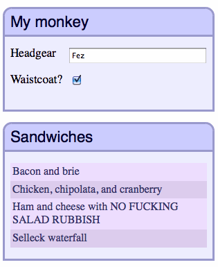
To put it another way, expanded is:
.monkey {
    background:#fff url(/images/monkey-bg.png) repeat-x 0 0;
    border:1px solid #fde;
    display:block;
    font-size:123.1%; 
    margin:1em;
    text-transform:uppercase;
}
compact is:
.monkey {background:#fff url(/images/monkey-bg.png) repeat-x 0 0;border:1px solid #fde;display:block;font-size:123.1%;margin:1em;text-transform:uppercase;}
I replied:
Expanded. Compact only works if you’re the only person maintaining it & don’t use source control. Otherwise, it’s stupid.
Now, I feel the need to defend this statement, because “stupid” is an emotive word, and it’s not one I use lightly. The nicest thing a colleague has ever said about me was that I “express strong opinions without threatening to break your fingers,” and calling something “stupid” is about as close to violence as I get. (Unless you get me started on RyanAir…but that’s another story.)
The first thing to notice about my comment is that it’s qualified: if you are the only person working on your CSS code, and you don’t use source control, then fine. Knock yourself out. Write the code however you want. Use single-letter class names for all I care. (Because they’re shorter and save bytes! But only lowercase single-letters because they compress better!) They key point is: you’re not harming anyone else.
But: if you use source control, that shows you care about before and after and the ability to keep a history of what’s going on with your code. Source control is all about changes between once version and the next, and no matter whether you are using a side-by-side or inline viewer to see the differences between two revisions, a shorter line length makes it easier to visually identify those differences.
Viewing differences becomes even more important as soon as there is more than one person working on the code, because you will be looking at the changes that other people make. The change between two revisions can often give you more information about the reason for a change than the new code can give you on its own. When it comes to maintaining a piece of software over a non-trivial lifetime, change tracking is vital to understanding both the codebase itself, and the underlying (business) requirements.
See, it’s not the readability of long lines in themselves that I question (research is vague, but I’m comfortable saying that 200-character lines help no-one); I’m more concerned about the secondary problem of being able to manage and understand changes in those lines over the long term and/or in a coding environment where you’re not the only contributor.
The best way to do this is to write each property on a single line. Writing single-line CSS rules harms maintainability, which is a bad thing. There is no technical reason to prefer compact CSS over expanded CSS (rule 1 applies to CSS as well as JavaScript), so the reason for writing single-line CSS is a personal preference. In my mind, it’s up there with smoking.
Okay, maybe not that bad. Most CSS won’t give you cancer. But I’m going to stick to my original assessment of “stupid”. I won’t break your fingers, but I will swear a lot while reading your code.
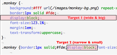
That said, there is an editability (as opposed to readability) argument to be made against long lines as well. This comes down to Fitts’ Law: if each property is on its own separate line, when you want to hit that property with your mouse pointer, you’re aiming for a much wider target than if the property is nestled somewhere in the middle of a single long line, as shown in the image below:

And if you prefer to use the keyboard, it takes fewer keystrokes to navigate and manipulate multi-line CSS than the single line versions. (Unless, of course, you use emacs, in which case there’s probably already a command to insert all those border-radius properties you wanted you to add.)
Further reading:
Radio Sunpig 2009: Thicker Ice
Reading about playlists this afternoon reminded me that I still hadn’t posted Radio Sunpig 2009…and it’s August of 2010 already. (Nothing new there, then.) But I can honestly say that I finalized the playlist itself at the beginning of January, and the artwork shortly thereafter. I even issued a couple of prototype CDs at the end of February, but it never went to a full production run (of the usual 7 copies). Oh well.
Radio Sunpig 2009 is subtitled “Thicker Ice” because it felt like in 2009 the Sutherland household was on a more solid footing than in 2008. It still had plenty of ups and downs, but the ups were upper and the downs were less down. A good foundation for 2010. And musically, it saw me start going out to live gigs again. Which is awesome. And any year in which I can get to see the Tragically Hip twice in the space of a single week has got a hell of a lot going for it.
- Battles – Atlas
 - Fight Like Apes – Tie Me Up With Jackets
 - Frightened Rabbit – The Greys
 - Phoenix – 1901
 - Apes & Androids – Nights Of The Week
 - School Of Seven Bells – Half Asleep
 - The Heavy – How You Like Me Now?
 - Deastro – Daniel Johnson Was Stabbed In The Heart With The Moondagger
 - Idlewild – To Be Forgotten
 - The Gaslight Anthem – The ’59 Sound
 - Bleu – Boy Meets Girl
 - The Temper Trap – Sweet Disposition
 - Wintersleep – Oblivion
 - Charlotte Hatherley – White
 - The Tragically Hip – Queen Of The Furrows
 - Cruiser – A Gentle Press
 - The Decemberists – The Hazards Of Love 4 (The Drowned)
 
As usual, message me for a download. You can’t get all of these tracks on Spotify 🙂
Barenaked Ladies at the Mountain Winery (Saratoga), 19 July 2010
I’m a big fan of the Barenaked Ladies. I love their music, the time I saw them live in 2001 was once of the best gigs I’ve been to. They brought heaps of energy and enthusiasm to the stage, and it looked like they were really having fun.
I was disappointed when Steven Page left the band at the sart of 2009 — his voice defined many of their songs, and I was sad that I wouldn’t hear him if and when I next saw the BNL live. (Martin’s rule of live performances is: always take the opportunity to see your favourite bands and artists live, because you never know when they’ll break up, or die.) This disappointment was reinforced when the band released a truly dreadful live recording of their first gig without Page in July of last year. Uh-oh, I thought. Guess that’s the end, then.
But no; their new album “All In Good Time” is pretty good. Not a BNL classic, but pretty good nevertheless. Ed Robertson sings most of the songs, but Jim Creeggan and Kevin Hearn both get more time on vocals (2 and 3 tracks respectively). And although I don’t particularly like Kevin Hearn’s voice in the abstract, somehow I do end up very fond of the tracks on which he takes the lead. (Watching The Northern Lights is sweet and delightful.) Go figure.
But still… a live performance? With the crowd clamouring for favourites like The Old Apartment and One Week that Steven Page used to properly belt out? My brother-in-law Mick mentioned to me a few months ago that the BNL happened to be playing a few gigs in California while we were going to be there. Despite my worries, it was too good an opportunity to pass by, especially because of the really cool-looking venues like the Mountain Winery. So tickets were bought.
Whoa, what a great evening.
First of all, the Mountain Winery is a lovely venue. You drive a winding road through the Saratoga hills to get there, and once you hit the car park you have a fabulous view out over Silicon Valley below. If you are willing to splash out the dough, you can have a gourmet dinner before the concert on one of the winery decks. And the stage itself is placed nestled in an intimate open-air amphitheatre at the heart of the estate, with vine-speckled slopes in the background. The seats have cup holders so you can enjoy a glass of the local wine with your music. It is very much a premium concert experience rather than a mere gig.
Another thing that made the evening great was that we took Fiona with us — this was her first concert! Fiona loves If I Had $1,000,000, and the BNL struck me as a good band to see as her introduction to live music. (“Daddy, will they be playing real instruments?”) She had a fantastic time, spending a good portion of the time dancing on her seat. Every few minutes she would tug on my arm and shine a massive grin at me. I love to see her so happy.
And the music itself? Wonderful. The band looked happy and relaxed on stage, and just as when I saw them before, they looked like they were genuinely having fun, doing something they love. Sure, the songs sound different without Steven Page’s vocals, but they have clearly adapted, and found new treatments for the old songs in his absence. But the band was in the groove, and the audience was thrilled. The atmosphere was fantastic. If, like me, you had any doubts about going to see them in the post-Page era, put them to rest. They’ve still got it.
Set list:
- Who Needs Sleep?
 - The Old Apartment
 - Falling For The First Time
 - Every Subway Car
 - Easy
 - Maybe Katie
 - Another Heartbreak
 - Tonight Is The Night I Fell Asleep At The Wheel
 - Sound Of Your Voice
 - It’s All Been Done
 - Pollywog In A Bog
 - You Run Away
 - Blame It On Me
 - Four Seconds
 - Big Bang Theory Theme
 - One Week
 - To Little Too Late
 - Pinch Me
 - If I Had $1000000
 
Encore:
- Ordinary
 - Watching The Northern Lights
 - Light Up My Room
 
Finally, an amusing note about the set lists that I post to my gig reports. I don’t take notes during the show; instead I memorize the set list using scenes and pictures I compose as the songs are played. For example, the first three songs of this concert formed into an image of someone asleep in a bed (Who needs sleep?) in an apartment (The Old Apartment), with a burglar falling down as he climbs through an open window (Falling For The First Time). It’s a simple trick, but it only really works for bands whose songs and lyrics I know well.
Normally I hold the pictures in my head for a day or two, but unless I revisit them, they fade away quickly. The curious thing about this concert was that I found myself remembering the images I had composed for the BNL gig I attended back in 2001. For that one, the first picture was of someone showing up late for an date at a bar (Too Little Too Late), having a big drink (Alcohol), telling his life story to his date (Life, In a Nutshell), then falling off his bar stool (Falling For The First Time).
I hadn’t recalled that picture for nine years, and then all of a sudden it’s right there again. Funny how the mind works.
