…are guaranteed to last up to 7 years.
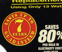
So if they last longer than 7 years…can I return them, complain, and get my money back?
No gods, no kings, no billionaires
…are guaranteed to last up to 7 years.
So if they last longer than 7 years…can I return them, complain, and get my money back?
I know it’s not particularly big or clever to make fun of foreign products trying to market themselves in English…but sometimes it can be just a teensy bit amusing. Take, for example, this GBA Movie Player adapter I’ve just bought, on a tip-off from WillC2 in a recent comment:

And on the back of the box, they decided that politeness was definitely the way to go for their basic instructions:
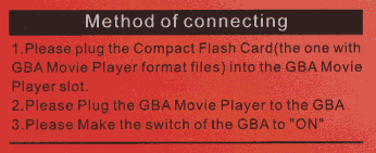
For all that, I have to say it’s a rather nifty little product.
Sense of humour? Check
Old save games (in case there are bonuses to be had, like in R&C 2)? Check
Honey-roast pueanut & cashew-flavoured nanotech upgrades? Check
Fully charged beerinator? Check
Qwarktastic. Go, go, go!
Nachos? Check
Hot salsa? Check
Big bag of chocolates? Check
Beer in the fridge? Check
We’re good. Go, go, go!
After seeing some photos of it on Alister Black’s blog, I felt inspired to visit the new Scottish Parliamant building at Holyrood, and the four of us trundled down there yesterday morning. It’s a truly extraordinary building. The architecture is lavishly unconventional, and almost every lower-level design feature, from the window frames to the chairs in the public gallery of the debating chamber, look like they could have been plucked straight from an modern art gallery. There isn’t a building like it in the whole of Scotland.
But.
Extraordinary doesn’t necessarily mean good, or appropriate, or worth what we spent on it (about £500 million–some ten times its initial budget).
In his book Emotional Design: Why we love (or hate) everyday things, Don Norman talks about three levels of design: visceral, behavioural, and reflective. Visceral design is all about plugging straight into the emotional centres of our brains. It’s about making things look, sound, and feel so good that their first impression has emotional and instinctive impact. From Emotional Design:
Because visceral design is about initial reactions, it can be studied quite simply by putting people in front of a design and waiting for reactions. In the best of circumstances, the visceral reaction to appearance works so well that people take one look and say, “I want it.” Then they might ask, “What does it do?” And last, “And how much does it cost?” This is the reaction the visceral designer strives for, and it can work.
Behavioural design is about using design to guide people’s behaviour, both consciously and subconsciously. It’s about functionality: making sure that people can use a thing to carry out the tasks it is intended to do. It’s where usability comes into play.
Finally, reflective design is about message, meaning, and perception. It’s the aspect of design that appeals to the intellect rather than the emotions. This can be tied to cultural factors, for example, knowing when a particular outfit will be right for a particular occasion. Or it can be tied to cleverness, for example, by subtly obscuring the purpose of a thing until an “oh!” moment of insight kicks in. Don Norman again:
Whether we wish to admit to it or not, all of us worry about the image we present to others–or, for that matter, about the self-image that we present to ourselves. Do you sometimes avoid a purchase “because it wouldn’t be right” or buy something in order to support a cause you prefer? These are reflective decisions. In fact, even people who claim a complete lack of interest in how they are perceived–dressing in whatever is easiest or most comfortable, refraining from purchasing new items until the ones they are using completely stop working–make statements about themselves and the things they care about. These are all properties of reflective processing.
The biggest mistake the Holyrood Building makes, in my opinion, is that its designed is wholly reflective. When I look at it, I find it beautiful because it is intricate, precise, modern, different, and amazingly clever. Take, for example, the design of the bicycle stands outside the main entrance:
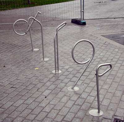
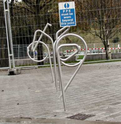
From the side, they just look like oddly twisted tubes of steel that you could chain a bike to. It’s only when you line them up and view them from the right height that they themselves resolve into the shape of a bike. Clever!
What I don’t feel when looking at it is, well, anything, really. It’s a purely intellectual appreciation. I don’t feel any kind of national pride stirring in my breast when I see it. There is no sense of majesty, or awe. No feeling that I’m looking at at an edifice with historical stature or permanence. There is no visceral component to it. I don’t think I’ll ever love it.
I think this is partly because of the location of the building: tucked away right down at the foot of the High Street, squeezed in behind a phalanx of offices and apartments. You don’t get anything more than a tantalising glimpse of it until you’re right there. Because all the land around it is built up, you can’t walk back a hundred yards to get a better view. (Or rather, you can, but you have to climb half-way up the Salisbury Crags, the hill that rises to the South in Holyrood Park. There’s no good view at ground level.)
Also, the building has no single front to it. Because it is so architecturally intricate and clever, it presents an interesting and totally unique face to each of a dozen different viewing angles. It has no identifiable silhouette. It has no single feature with souvenir potential. In a way, it feels like a hypercube: a shape that mere 3-dimensional beings are fundamentally unequipped to perceive as a whole.
This is a particular problem in Edinburgh, which is, in visual terms, dominated by the castle at its heart. I know that the parliament building was never intended to rival the castle for grandeur–especially as it’s Scotland’s parliament, not just Edinburgh’s. Still, leaving aside questions of what the money would have been better spent on, I feel that for half a billion pounds we ought to have got something magnificent in return.
Just a quick plug for the new album by Scottish band The Blue Nile: High. Mellow, melodic, deliciously moody, and over far too quickly. I’ve only listened to it a few times, but I can tell it’s going to stay under my skin for a long time. You need to own this disc.
Update (5 November): After listening to it a few more times, it seems to have lost some of its initial magic. There are still about three or four stand-out tracks on it, but the overall brilliance seems to have worn off rather quickly. Huh. So much for my musical radar.