Marching ants in CSS

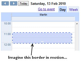
A couple of days ago I noticed that Goooogle uses a marching ants effect on their new mini-calendar event view. It highlights the target time frame for the event you’re editing, and it indicates a draggable and expandable area. (It’s probably been there for ages, but I’m slow like that.)

Marching ants effect in Google Calendar.

Being a colossal geek, the first thing I did was run up Firebug to see how they’re doing it, because there is no “border-style: marchingants” in CSS. It looks like Google is doing it with JavaScript. The area in question is bounded by four long but thin div elements (tall and narrow for the vertical borders, short and wide for the horizontal borders).

<div class="sc-ants sc-ants-top"></div>
<div class="sc-ants sc-ants-left"></div>
<div class="sc-ants sc-ants-right"></div>
...
<div class="sc-ants sc-ants-bottom"></div>

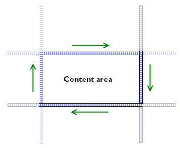
These divs sit inside a parent container with overflow:hidden, so you only see a small slice of their full extent. The border divs themselves have size, but no content. Their entire area is taken up by a 2px-wide dashed border:

.sc-ants-top  {
    border-top:2px dashed #6688EE;
    height:0;
    top:0;
    width:10000px;
}

Finally, there is a JavaScript timer that changes the position of these divs, moving them a pixel at a time to achieve the marching ants effect.
Even in native applications, marching ants are not all that common, and I think this is the first time I've seen them in a web application. Given that draggable/resizeable areas are also not all that common in web apps, I think it's a clever and elegant way of highlighting that there is something different an unusual about that area.

On the other hand, I'm not mad keen on keeping JavaScript timers running just to keep screen elements in their appropriate position, so I wondered if there was a way of doing this with just CSS instead. And of course there is: have a look at the demo page.

I started with a block of HTML in the standard module format, because it's a good basis for isolating areas of content. The div.bd holds the actual content to be highlighted, and the other parts of the module are used for creating the borders, as follows:

  • The outermost div is given a left-hand pseudo-border by using a background image with repeat-y only, positioned slightly to the left of the left edge, so that only the rightmost two pixels of the image are visible.
  • Likewise, the .inner container is given a top pseudo-border.
  • The .hd block makes the right-hand border. It is positioned absolutely on the right edge of the module, 2px wide and 100% tall, and has a background image with repeat-y.
  • The .ft block makes the bottom border. It is 2px tall and 100% wide, and also has a background image.

Here's how it looks inline:

Marching ants!

The actual animation is achieved with a couple of old-skool animated GIFs, ants-horizontal.gif and ants-vertical.gif. The horizontal GIF contains two checkerboard patterns, one moving to the left, and one moving to the right; the vertical GIF has the checkerboard patterns moving up and down. Each border only uses half of one of the GIFs, which is you only need two images rather than four.

If you are content with the border being a single pixel thick, and the ants flowing from one corner to the opposite, then you could get away with just one animated GIF — see the wikipedia article on marching ants for an illustration. Personally, I prefer the animation to flow round the border in a continuous pattern.

Of course, this is far from the only way you could implement the marching ants effect. You could use webkit's CSS animations instead. The demo page includes an example of how to do this as well. The basic principles are exactly the same: set up a standard module, and use GIF images to form the necessary borders. But instead of using animated GIFs, you can use just a single static checkerboard image, and use up/down/left/right animations to move around the background instead:

.marchingants {
	-webkit-animation-name: march-up;
	-webkit-animation-duration: 0.3s;
	-webkit-animation-iteration-count: infinite;
	-webkit-animation-timing-function: linear;
}
@-webkit-keyframes march-up {
	from {
		background-position-y: 8px;
	}
	to {
		background-position-y: 0;
	}
}

One neat thing about the CSS animation version is that you can vary the speed of the animation without having to edit the GIF file. The obvious drawback is that it (for now) only webkit browsers support CSS animations. But given how easy it is to implement this in a cross-browser compatible manner, right now I'd suggest sticking to the animated GIF version.
The double-padding/nowrap bug: how to make IE6 hit 100% CPU usage with some simple HTML + CSS

I came across an amusing bug in IE6 last week. The existence of a bug in IE is no great surprise, but the way it manifests itself is quite interesting: with just a tiny bit of HTML and CSS, you can cause IE’s CPU usage to spike up to 100% and stay there, slowly leaking away memory. It seems unlikely that this has never been seen before, (especially as it doesn’t occur in the IE7 beta), but I couldn’t find a reference to it anywhere on the web, so I’m posting it here.

It starts off with a simple piece of HTML:

<!DOCTYPE HTML PUBLIC "-//W3C//DTD HTML 4.01//EN"
            "http://www.w3.org/TR/html4/strict.dtd"><html>
<head>
   <title>IE6 100% CPU test page</title>
</head>

<body>
   <table>
      <tr>
         <td>
            <p><span class="test">abcd efgh ijkl mnop</span></p>
         </td>
      </tr>
   </table>
</body>
</html>

Especially in table-based layouts, it’s not unusual to see a span wrapped in a p wrapped in a table cell. The problem kicks in, though, when you apply the following CSS:

<style type="text/css">
   p {
      padding:0.5em;
      position:relative;
      white-space:nowrap;
   }
   span.test {
      padding:1em;
   }
</style>

Setting the position of the p is potentially unusual, and you might wonder why the white-space:nowrap is being applied to the paragraph rather than the span, but at least on the surface, it all looks kosher. Nuh-uh.

I’ve set up a test page with exactly this code in it. Try using IE6 to visit it. Does everything seem to be working as normal? How about if you try resizing your window to narrow it down…and down…until it’s just wide enough to hold the text. Oh no! It’s dead. Poor IE.

Now imagine the text in the cell being wider, or the table having several of those cells in a row, so that even at a normal window size the CPU usage spikes as soon as you load the page. Major bumcraft. This was a pig to track down and debug.

But even having reduced the problem to a simple test case, I’m still not sure why this should go wrong. It looks like IE’s rendering model is unable to resolve a circular reference between the p and the span when the forced width of the nowrap and the added paddings interact. But beyond that…mmmidunno. As always, it pays to be on your guard when dealing with IE and padding.

Update (20 Feb 2006): After playing around with this bug a bit more, I’ve found that it’s even worse than I’d first described. You don’t even need the p to be embedded in a table cell to bring IE down. Using the same CSS as above, the following HTML is sufficient (example 2):

<!DOCTYPE HTML PUBLIC "-//W3C//DTD HTML 4.01//EN"
            "http://www.w3.org/TR/html4/strict.dtd"><html>
<head>
   <title>IE6 100% CPU test page</title>
</head>

<body>
   <p><span class="test">abcd efgh ijkl mnop</span></p>
</body>
</html>

You don’t even have to use a p and a nested span, either. Although I haven’t tested every possible combination, it looks like any inline element nested within a block-level element shows the same behaviour, e.g. an em within a h3 or an a inside a div. If you nest a block-level element inside another block (e.g. a p inside a div, everything’s fine.

What’s even more amusing is if you remove the DTD from the HTML above, and watch what happens (example 3). IE still goes to 100% cpu, but it retains just enough spare capacity to refresh its display. This time, if you narrow the window down, the text disappears, and the window’s vertical scrollbar makes it look like the page has got enormously tall. But if you try scrolling up and down, the content is nowhere to be found. If fact, it looks like IE is still trying to figure out where the content should go, too: if you scroll part-way down the (blank) page, you’ll notice the scroll block jumping up and down like a confused monkey.

But then if you try to widen the window back to its original size, it freezes up completely again.

And yes, it also works if you place the style definitions inline, rather than in a <style> block (example 4):

<html>
<head>
   <title>IE6 100% CPU test page</title>
</head>

<body>
      <p style="padding:0.5em;position:relative;white-space:nowrap"><a style="padding:0.3em" 
href="http://www.example.com">abcd efgh ijkl mnop.</a></p>
</body>
</html>

If you needed another reason why it’s a really bad idea to allow visitors to use HTML in your blog comments section, well, there you go.