Yesterday evening I showed Fiona Roman Mars’s TED talk on the design of flags:
In his closing remarks, he says:
If you see your city flag and like it, fly it. Even if it violates a design rule or two; I don’t care.
But if you don’t see your city flag…maybe it doesn’t exist. But maybe it does — and it just sucks.
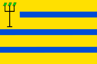
Here in Oostzaan, it’s hard to avoid the city (town, village, gemeente) flag. It’s everywhere. Its design is fairly simple and recognizable:
The same elements are found on the city (town, village, gemeente) coat of arms:
Until today I had no idea what the three-pointed thing on the flag is. According to the Heraldry of the World site, the current city crest, as recorded in 1949, represents a three-pointed pitchfork, with each prong stabbing a sod of green earth. (“In goud 3 smalle dwarsbalken van azuur; over alles heen een drietandige greep van sabel met aan iedere punt een graszode van sinopel. Het schild gedekt met een gouden kroon van 3 bladeren en 2 paarlen.“)
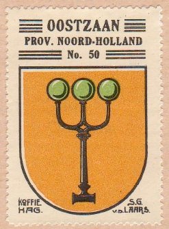
The emblem was different before 1949. The gemeente’s arms were first officially recognized by the Dutch Hoge Raad van Adel (the High Council of Nobility, your one-stop shop for flags, heraldry, titles, and other noble paraphernalia) in 1816. At that time, they were defined as “Van goud, beladen met een drietandige vork van sabel, aan welks punten 3 kazen van sijnopel.” That’s right, the pitchfork used to stab green cheeses. This stamp from the 1930s shows regionally appropriate spherical cheeses being used:
(That stamp itself is from a fascinating slice of early 20th century history, the Koffie Hag Album of Dutch Heraldry, which was a special book for collecting the heraldic trading cards issued by the Koffie Hag company.)
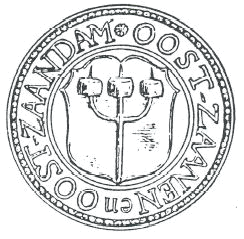
This illustration of an even older stamp shows the pitchfork impaling wheel-shaped cheeses:
But although the emblem wasn’t formalized until 1816, it has an even longer history. No one even know when it first originated. One story suggests that in the time of the Eighty Years’ War with Spain, an Oostzaan buccaneer was taking part in a raid on a Spanish ship off Amsterdam. He couldn’t find any Spaniards to kill, but he found three cheeses and stabbed them instead. Way to go, buccanneer guy! I reckon this one is a drunken Pampus tale.
An alternative explanation for the cheeses being green is that they’re not really cheeses, but cabbages. The Oostzaan region used to be known for farming cabbages, and Oostzaners used to be nicknamed “Kooleters” or “Koolhanen” (cabbage eaters). That would cover the “green” and “round” aspects. But whether they’re cheeses, cabbages, or grass sods, they’re an unmistakable link to the agricultural heritage of the region. Totally unmistakable.
So now I know a bit about the Oostzaan flag. But yesterday evening I was even more more curious about the flag of Zaandam, our big town next door. The Oostzaan flag is everywhere, but I couldn’t recall ever having seen a Zaandam flag. A quick search revealed it to be this gorgeous piece of work:
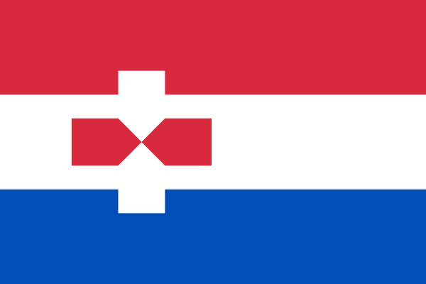
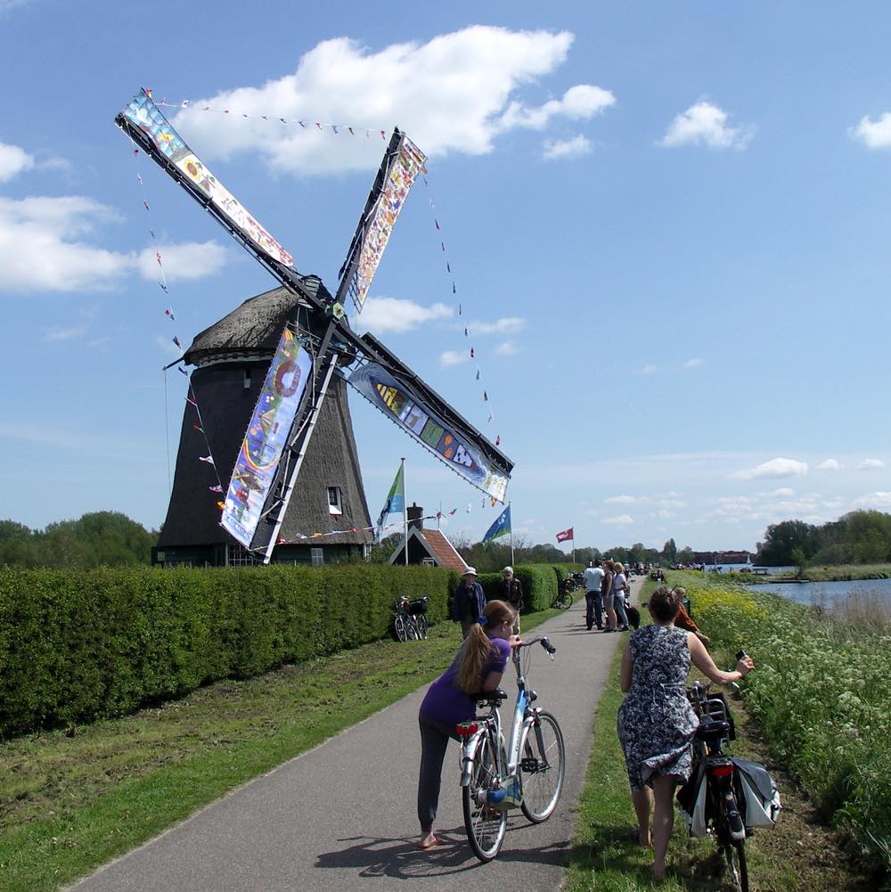
Just look at that! The red, white, and blue background are the same as the Dutch national flag, but right in the middle there’s a freaking windmill carved out of negative space. The Zaan area is one of the world’s first industrialized areas, powered by literally hundreds of windmills.
Here’s Roman Mars again:
I’ve seen first-hand what a good city flag can do in the case of Chicago. The marriage of good design and civic pride is something that we need in all places. The best part about municipal flags is that we own them. They are an open-source, publicly owned design language of the community. When they are done well, they are remixable, adaptable, and they are powerful.
We can control the branding and graphical imagery of our cities with a good flag, but instead, by having bad flags we don’t use, we cede that territory to sports teams, and chambers of commerce, and tourism boards. Sports teams can leave and break our hearts (and besides, you know, some of us don’t really care about sports!), and tourism campaigns can just be cheesy.
But a great city flag is something that represents the city to its people, and its people to the world at large. And when that flag is a beautiful thing, that connection is a beautiful thing.
The Zaandam flag is a gorgeous, cheeky piece of design that takes that history of the area and places it right at the heart of the whole country. With style. I can’t believe we don’t see it on every street corner.