When I was younger, Palmolive shampoo came in a pale green bottle. I remember it because I loved the shape of the bottle: a tall cone (broad at the base), made of fairly soft plastic, with four indentations for your fingers on one side and one for your thumb on the other. It was easy to grab in the shower.
In more recent years, the bottle design has been a flattened cone, but the quirky finger and thumb indentations remained. I’m not obsessive about the brand, and while we were living in Scotland I was more of a whatever’s-cheapest-at-the-supermarket consumer. When we moved to the Netherlands in 2007, the brand and the smell of the shampoo triggered fond childhood memories for me at a time when I was feeling homesick and adrift.
So I’m sad to see that they’ve abandoned the idiosyncratic shape for a bland ovoid in their latest redesign. In terms of packing efficiency, they can probably squeeze more units into a carton now.
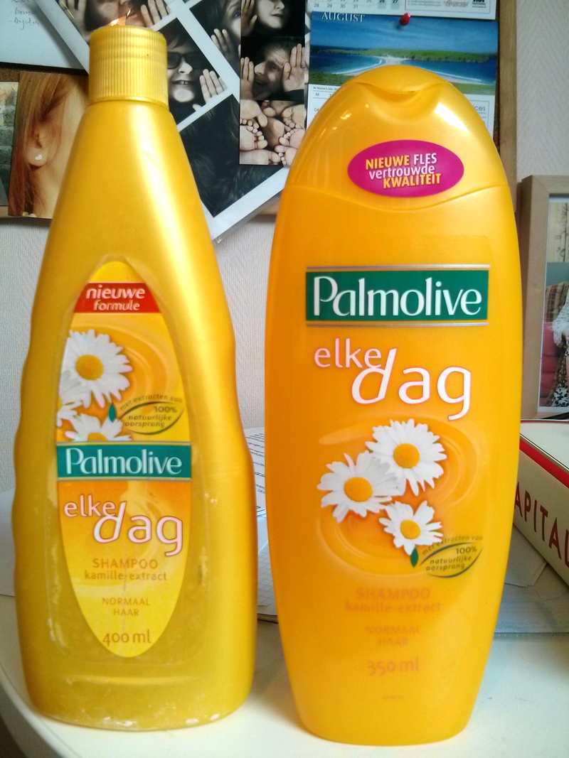
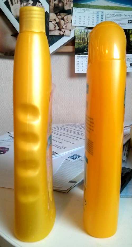
They sneakily reduced the volume of contents as well, from 400ml to 350ml, yet without a consumer-level price change. Note the reduction in contrast between the printed “350ml” text and the bottle colour. Coincidence, or just a way to distract from the change?
I’m not this obsessive about every item on my weekly shopping list, honest.