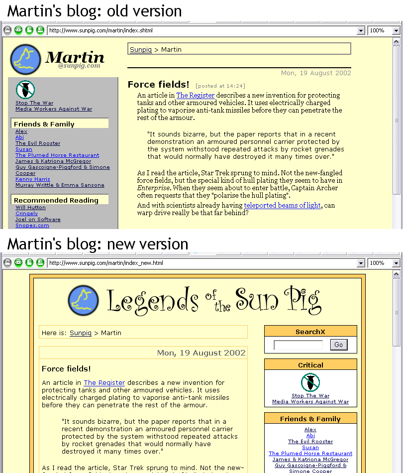
Okay, so I decided to redo my little section of the web. (Click here for a look at the old and new designs side-by-side.) I wanted to take advantage of some of the things that Movable Type allows you to do, such as comments, and sorting entries into categories. But I made the foolish mistake of also deciding to change the visual design of these pages, too. As Mark Bernstein writes in his article, “10 Tips on writing the living web”, ” Don’t rush to replace a good design: you will grow bored with it long before your readers do.”
Can…of…worms.
So what am I trying to do?
Web programming is my day job. Not web design–although I have a modest eye for graphical design, and I can wield Photoshop filters without hurting myself or too many innocent bystanders, that’s not my real field. User experience, and information architecture are more up my street.
And yet…. The Movable Type blogging community seems to contain a disproportionate number of highly talented visual designers. (Christian Crumlish of Radio Free Blogistan also comments on this in his comparison of Radio Userland and Movable Type.) So, despite my desire to make the site simple, accessible, and usable, I also had a strong urge to make the look and feel not suck. But how?
Standards? What standards?
First of all was the decision on what flavour of HTML to use. HTML 3 or 4, or XHTML? CSS or tables and tags? This is a question about browser support and standards support. While it may be nice to try and support all browsers, and make sure that the design looks the same on anything that accesses the pages, to do this often requires extensive hacking about of HTML, to the extent that the code no longer adheres to any of the W3C standards. Alternatively, by producing a design that sticks closely to pure standards, once you go back a few browser versions your site often looks like kack.
A third way, of course, would be to run with a highly minimal design, presenting content with little more than the basic <hN> and <p> tags (hello, HTML 2!), but that violates my stated desire to make it stand up to the current crop of blogs in terms of prettiness. And there is actually a two-and-a-halfth way: spend vast amounts of time making the site standards compliant and backwards compatible and pretty. The key sticking point for me being the “vast amounts of time”.
(And don’t talk to me about browser detection. There’s little more annoying that trundling along in the latest version of Opera, with excellent support for all the latest web standards, and coming across a site that tells you to upgrade because it figures that nothing other then IE or Netscape is capable of rendering their pages.)
A quick look at the server logs for the Sunpig web site showed that the bulk (I use that word in the loosest possible sense–the site just doesn’t get that much traffic) of all visitors are using IE5, IE5.5, IE6, or something that is identifying itself with a user agent string of “Mozilla/5” (not quite sure what that one is…).
So most people who stop by here are using a “modern” browser, with plenty of support for CSS. I can make the site pretty for them. But I want to make sure that the site’s content is at least available and accessible to people with older browsers, or with text-only browsers or screen readers. The conclusion, then, is to go with the W3C standards-based approach.
Usability and accessibility
But even with a pure XHTML site, it’s still very easy for pages to look rubbish on browsers that don’t handle your CSS properly. For example, the XHTML can be written in such a way that the real content of the page is right at the bottom of the document, while the top part is taken up by navigation, sidebars, links, and other stuff. Although the content may then still be shown at the top, or in the centre of the page of a CSS-enabled browser, text-based browsers and screen readers will ignore this positioning. They’ll happily show all the gristle before getting down to the meat and bones.
This is annoying and unfriendly because you have to skip over unnecessary stuff to get at the page content. And even though very few people coming to this site will be affected by this issue, it’s a well-known accessibility issue. It’s also very common: have a look at the source behind a random web site, and see where the content is listed.
A lot of the other things I considered while I was designing the site came under the accessibility/usability banner:
Font sizes.
Internet Explorer provides a simple mechanism for making fonts on a page bigger or smaller. This makes it easy for people with poor eyesight to enlarge the fonts on a page to make the site more readable. However, this only works if you don’t specify absolute font sizes in your style sheets. I decided it was more important for fonts to be user-resizable than for the fonts to appear at exactly the same size in every browser. (See also: Jakob Nielsen’s alertbox article Let Users Control Font Size, and Dive Into Accessibility
Use real headers
If a piece of text should be displayed as a header, use proper HTML <hN> tags (i.e. <h1>, <h2>, <h3>, etc.). HTML markup is designed for tagging the different parts of a document, such as headers, paragraphs, quotes, lists, etc. CSS can be used to modify the size of headers, and where they’re placed, so there is really no reason to not use them. And a couple of good reasons to use them are that search engines respond well to the use of header tags, and that Opera gives you keyboard shortcuts (“S” and “W”) to move between headers. And yes, this is also another good reason to be using Opera!
Keep paragraphs narrow
On-screen text is hard enough to read as it is. Paragraphs that span the entire width of your browser window are measurably less readable than narrow paragraphs. The eye just has less distance to travel in scanning from one line to the next, which givces the brain less time to get distracted. So my main text content had to be width-restricted.
Minimal images
The vast majority of web users are still on slow dial-up connections. Images may give you more flexibility in designing a pretty page, but they can also add a lot to the time it takes for the page to load. Fast page loads make a web site feel responsive, and who doesn’t like that? Therefore, I wanted to make sure that I included few images, and that the ones I did include were as optimised as possible.
But what does it all mean?
What it all adds up to is that the site redesign took a lot more time than I had originally thought. But I think I have achieved what I set out to do: put together a web site that is nice to look at, and draws on usability and accessibility best practices. And that is a very satisfying thing.
But there is another side to the redesign of the site, and that is the Information Architecture of it all. Things like, how should the archives be structured? How should I organize the links in my sidebars? What categories am I going to use?
I’ll cover the IA aspects of the redesign in part two of this article.