I bought a Lumia 930 in October 2015 to replace my old iPhone 4. I didn’t want to spend €800+ on a new iPhone, and my feelings about Android were mixed. The Lumia 930 was the previous year’s Windows Phone flagship. The 930’s camera was very well-regarded (the most important feature for me), and I have always found the Windows Phone UI pleasing. With lots of people waiting for the release of the 2015 Lumia models, I was able to buy a 930 at a great price.
I wrote about it again in March, just after it had received the Windows 10 update. So how do I feel about it now, after using it for a whole year?
Well, hmm. It still works, but I wouldn’t say I’m loving it.
Let me take a minor niggle first. I listen to a lot of podcasts. I use the default Windows 10 Podcasts app. I pause and restart podcasts from the lock screen all the time. If a podcast has been paused very recently (and I haven’t timed this, but it feels like about five minutes or so, before the phone puts the app into some kind of deeper sleep mode), pressing the side power button will bring up the lock screen with audio playback controls visible. I press play, the podcast starts again, and all is good.
But if the podcast has been paused for longer, I have to press the side button to bring up the lock screen, and then use one of the volume buttons to show the audio controls. Fair enough; another button press doesn’t bother me. What does bother me is the fact that the “play” button doesn’t work immediately. I have to press it twice to get it to actually start the podcast going again.
Minor niggle, but I find it disproportionately annoying. Also, in the last couple of months, every now and then the Podcasts app just won’t stop playing. The controls on the lock screen don’t work; the controls in the app don’t work; plugging and unplugging my headphones doesn’t work; force-quitting the app doesn’t work. The only thing have found that will stop the podcast playing is to reboot the phone. Maybe I should try a different podcasts app. But I’d prefer the default one to work better.
I also have minor gripes about the browser (no ad blocking), the email client (not great at displaying HTML formatted mails), and the lack of apps in the app store (getting better now that Windows 10 has been around for a while).
Worse, though, is the camera. I have taken some pretty nice pictures with it over the last year, but its low light performance has been consistently disappointing. Earlier in the year I also started noticing a pronounced blurring in the bottom left corner side of (landscape) photos. It’s there in portrait orientation as well, but because that part of the picture often captures the sky, it isn’t always obvious.
Here are some of the first photos where I noticed the problem, back in April. (Click for full-resolution versions, and check the bottom left and top left corners respectively.)


I’ve gone back to some of the early photos I took with the phone, looking for sharply focused images with enough detail in that bottom left corner that a problem would be visible. And sure enough, it looks like it has always been there — I just didn’t spot it.

It has bothered me since I became aware of it, but I’ve just put up with it. I’ve learned to frame my photos with that in mind, or to strategically crop them afterwards. But that’s not a great solution, and it has been contributing to my general feeling of discontent with the phone. I’ve been thinking about photos a lot lately (another post about that coming up soon), and earlier this afternoon I downloaded a set of lens correction profile reference images from Adobe for an experiment. I don’t have a tripod for my phone, and I didn’t set up additional lighting, but I took some reference pictures with my Lumia 930 and my iPad mini 2 (2013) anyway.
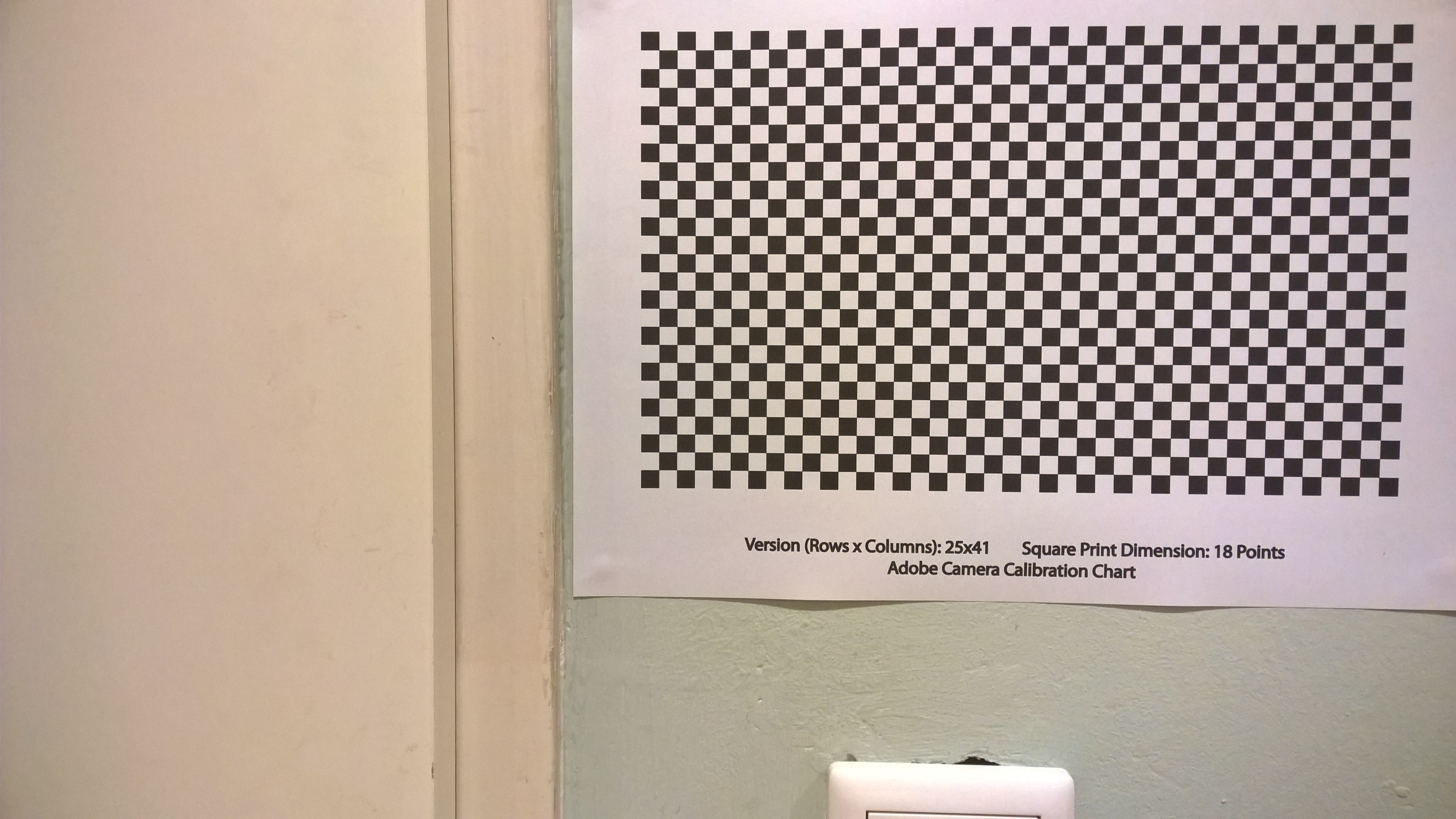


Even poorly shot reference images like these make it easy to spot flaws. There appears to be some minor vignetting in the top right corner of the Lumia, but it’s obvious that the bottom left corner has some pretty severe distortion going on. I don’t know enough about camera optics to guess whether this is the lens or the sensor, but something is awry. Also: what the heck is going on with the Lumia’s colour processing? This is one of the things I meant by its poor low-light performance. The iPad mini captured the green wall accurately under the indoor LED lighting. The Lumia is just badly confused.
I can live with a podcasts app that has hiccups and crashes. But an unreliable camera makes me sad, and makes makes me use it less — which is exactly why I wanted to upgrade from the iPhone 4 last year. When the iPhone 7 was announced with two cameras in the Plus model I was excited and tempted by it, but I still can’t get past the price tag. I know I could get better photos than even the iPhone 7 would yield from our ten-year-old Konica Minolta DiMAGE A200 (which has a colossal aperture compared to every phone camera), but I’m not going to carry that around with me all the time.
Maybe I’ve been going at this with the wrong attitude. I’ve been assuming that there’s nothing I can do about it except wait until I upgrade again. But I just dug out the invoice for the purchase, and apparently the phone is still under warranty for another 9 months. I don’t know if that’s the store’s warranty or the manufacturer’s, but I think I need to find out. I’d happily keep using it for another year if I didn’t feel a twinge of regret every time I wanted to take a picture with it.
Update (20 October): I took the phone back to CoolBlue on Monday, and they took it in for a warranty repair.