Geeknotes 20081231: The good-riddance-to-2008 edition

(Note: this entry was originally written for the Skyscanner Geeks blog.)

HTML, CSS, JavaScript

  • YQL (Yahoo! Query Language) allows you to easily grab XML or JSON data from Yahoo’s services (Search, Flickr, weather, social, Upcoming, et al.) using a SQL-like query language. Christian Heilmann explains. (Being a massive Yahoo! fanboy, I can’t help but jump up and down excitedly.)
  • Dustin Diaz on using a super-simple skinny doctype. One benefit of using this is that you save bytes. Personalyl, I can never remember the proper syntax and URL for the HTML doctypes, so this is going to save me the hassle of looking it up every time I make a new page. (Templates? Phooey.)
  • Cameron Adams built a drum machine in JavaScript: the JS-909. (Via Dan Cedarholm)
  • Chris Anderson of Sitepoint takes a look at CSS3, and how we can use it to create box shadow and rounded corner effects. (Remember that cross-browser compatible does not have to mean cross-browser identical.
  • The YUI Doc tool is an alternative to JSDoc for generating documentation of JavaScript code.
  • A suite of feature detection tests to use as an alternative to browser sniffing. (Via Ajaxian).
  • A new “Lorem Ipsum” generator: HTML-ipsum.com gives you chunks of lipsumized HTML, instead of just lipsum text. (Via Andy Clarke)
  • Steve Souders looks at the state of web performance in 2008 See.also Douglas Crockford’s talk on Ajax Performance.

Scaling, clouds

Browsers

Software development

  • They Write the Right Stuff” by Charles Fishman in FastCompany. An article on the software developers who write the code for the Space Shuttle: “The group’s most important creation is not the perfect software they write — it’s the process they invented that writes the perfect software. It’s the process that allows them to live normal lives, to set deadlines they actually meet, to stay on budget, to deliver software that does exactly what it promises. It’s the process that defines what these coders in the flat plains of southeast suburban Houston know that everyone else in the software world is still groping for. It’s the process that offers a template for any creative enterprise that’s looking for a method to produce consistent – and consistently improving — quality.”
  • Daphne Dembo, Engineering Director at Google, describes some of their challenges in developing a fully international search engine.

All the rest

Geeknotes 20081116: The Unistable Polyhedron edition

(Note: this entry was originally published on the Skyscanner Geeks blog.)

CSS, Typography, Design, User Experience

Coding

Threading, Scaling, Clouds

Other Geekery

  • For those times when you want to talk about your shiny new idea but are worried that your buddy might nick it, Rands delivers the FriendDA.
  • A unistable (or monostable) polyhedron is a shape that will only balance on one of its faces (assuming uniform density). The unistable polyhedron with the fewest known faces is shown below. See notes at Wolfram Mathworld and the Mathematical Association of America. (Via the Risks Digest.)

unistable-polyhedron.png

Geeknotes: Friday 17 October

(Note: this entry was originally published on the Skyscanner Geeks blog.)

Security

Front-end?

Browsers

Other Geekery

Maintainable CSS: modular to the max!

(Note: this entry was originally published on the Skyscanner Geeks blog.)

In recent years, the issue of getting developers to write CSS in the first place has been one of the big issues facing web standards evangelists β€” hence the enormous number of articles you’ll find around the web about CSS basics, and techniques to achieve specific visual results. Designers like Dave Shea and Andy Clarke (and many others) have helped us push the boundaries of what is considered possible with HTML and CSS. And although far from all problems are solved (think: multi-column lists), you can usually google around and come up with a recipe to achieve most of the everyday effects that people have come to expect circa 2008.

But putting together a snippet of CSS to give a block of text a background gradient and rounded corners is not the same as building the styles for a dynamic site designed to evolve over the course of several years, and to be worked on by many people in parallel. As Natalie Downe said in her recent presentation at BarCamp London, this is not a solved problem. In many ways, CSS is like regular expressions: much easier to write than to read.

There are many useful techniques for making CSS more readable. Two of my favourites are indenting selectors to indicate element hierarchy or specificity, and keeping the rules in a consistent (e.g alphabetical) order. For example:

div.monkey {
   border:1px solid #99f;
   margin:2em;
   padding:0.5em;
   position:relative;
   }
   div.monkey div.fez {
      background-color:#eef;
      color:#003;
      position:absolute;
      width:200px;
      }
      div.monkey div.fez label {
         font-size:1.2em;
         left:0;
         }
         div.monkey div.fez label.waistcoat {
            left:100px;
            }
      div.monkey div.fez input {
         padding:0.2em;
         }

However, readability is only the first step towards maintainability. No matter how you comment, indent, or structure your CSS, if you jam all your declarations into a single “main.css” file, you’re still doing it wrong.

In his presentation at Fronteers 2008, Stephen Hay discussed separating a site’s CSS into three different files, one to define layout, one for colour, and one for typography. This is not an uncommon approach. Mike Stenhouse calls it modular CSS, and Jeff Croft talked about it in the ALA article Frameworks for Designers. These approaches recognize that it’s madness to keep all your styles in a single file, but they all want to keep the number of CSS files small.

But in cases where you’re working with larger teams of designers or developers, I think this is wrong, and may actually harm maintainability. When you’re working with larger teams, you should be using more files, not fewer. Once you have taken the small step of moving your styles out of a single file and into three, four, or five thematic files, the next big leap is to take that modularity to the max, and create ten, twenty, or more .css files!

But what about performance!? Haven’t we all learned to minimize HTTP requests?

The key to making this work is a build process. A build process allows you to separate your development code (the files you work with) from the machine code that gets served to a browser. Christian Heilmann has been evangelizing this for ages, and almost exactly the same techniques apply to CSS as well as JavaScript.

Development code is what you read and write, and check in to your source control system. It should be highly modular (split over many files), extensively commented, and should make liberal use of whitespace to indicate structure.Machine code is what gets served up to a browser. It should consist of a small number of merged files, and should be stripped of comments and unnecessary whitespace. Your build process is the mechanism with which you apply these transformations. Finally, your web server should deliver the machine code with gzip compression for extra speediness.

Development code is for humans, machine code is for machines. It’s humans who will be maintaining your code.

So what humans see is a large number of files (potentially organized into multiple folders):

  • reset.css
  • grids.css
  • fonts.css
  • headers.css
  • header_navigation.css
  • footer_navigation.css
  • top_adverts.css
  • forms.css
  • etc.

In the olden days, you would bring all of these files together with a bridging file, with @import rules to reference them all. Don’t do that, because each @import rule causes another HTTP request. Use your build process to stitch the files together into a single file (“merged_styles.css”), and serve that instead. Alternatively, you can use a script to do the merging on the fly: Cal Henderson’s article Serving JavaScript Fast describes how to do this.

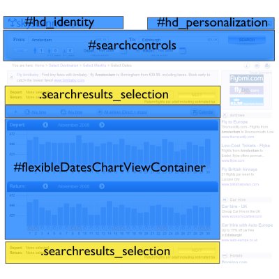
How you split up your CSS files is up to you, of course. Here at Skyscanner, we use the basic YUI CSS core (rest, fonts, grids) to apply a common baseline to all pages. The content that goes onto the pages is then separated into major blocks, each of which has a very specific ID or class name:

skyscannercss.jpg

If a content block is designed to appear once on a page, we assign it a unique id. If it will appear multiple times, we give it a unique class. Each content block has its own CSS file:

  • id_identity.css
  • id_personalization.css
  • id_searchcontrols.css
  • class_searchresults_selection.css
  • id_flexibleDatesChartViewContainer.css
  • etc.

We have about 70 CSS files at the moment, each one handling the presentation of a very specific part of the site. Inside each CSS file, all of the rules are scoped to that specific id or class name. For example:

#hd_identity {
   float:left;
   height:40px;
   overflow:hidden;
   width:500px;
   }
   #hd_identity a {
      display:block;
	  height:100%;
	  padding:0;
	  margin:0;
   }
   #hd_identity.home {
      height:55px;
	  margin-bottom:20px;
	  margin-top:60px;
   }

The key benefit of this arrangement is that a developer can edit the CSS for a specific content block and be confident that their changes will not affect any other part of the site, because the rules are so narrowly scoped. This is very important when you want to split up work into streams that many developers can work on in parallel.

Depending on your perspective, however, you might see this as a huge drawback. One of the main benefits of CSS, after all, is supposed to be that you can apply visual changes to your whole site by changing a set of common rules. But when you’re working with a highly heterogeneous site with lots of differently styled content and controls, and you have multiple developers all making changes simultaneously, “common styles” are a minefield. You invariably end up with situations where Alice has ownership of feature A, but is reluctant to make changes to the common styles in case they have a knock-on effect on Bob’s feature B β€” so she adds a bunch of extra classes and exceptions to ensure that her changes stay isolated.

By using a highly modular CSS structure and a good build process, you are embracing that isolation. Most sites and projects spend most of their lifetime in maintenance mode, and a technique that helps reduce the potential for accidental errors when you’re making changes and bug fixes is a good thing.

Microsoft and Nokia adopt jQuery

(Note: This entry was originally published on the Skyscanner Geeks blog.)

Here’s something I didn’t see coming:  Microsoft and Nokia have announced that they are adopting jQuery as part of their application development platforms

What this means on the Microsoft side of things is that they will provide an intellisense-annotated version of jQuery for Visual Studio 2008 (available as a separate download in a few weeks), and will also distribute it as part of the forthcoming ASP.NET MVC release.  Expect it to be even more tightly integrated with the newly announced Visual Studio 2010. (We’re talking about products with 2010 as part of their version name? Already?)

Further notes on the announcement and integration:

We use YUI as the base library for our JavaScript code at Skyscanner, but jQuery is a sweet and slick package. Making it part of the ASP.NET MVC release is a splendid idea. The ASP.NET page model has always felt fat and bloated to me, and the Atlas extensions are a very clever but awkward hack to tap into this model. The combination of ASP.NET MVC + jQuery might actually allow you to write clean web pages with progressively enhanced Ajax functionality out of the box.

Might .NET actually become a cool platform for writing web apps?