(Note: this entry was originally published on the Skyscanner Geeks blog.)
In recent years, the issue of getting developers to write CSS in the first place has been one of the big issues facing web standards evangelists — hence the enormous number of articles you’ll find around the web about CSS basics, and techniques to achieve specific visual results. Designers like Dave Shea and Andy Clarke (and many others) have helped us push the boundaries of what is considered possible with HTML and CSS. And although far from all problems are solved (think: multi-column lists), you can usually google around and come up with a recipe to achieve most of the everyday effects that people have come to expect circa 2008.
But putting together a snippet of CSS to give a block of text a background gradient and rounded corners is not the same as building the styles for a dynamic site designed to evolve over the course of several years, and to be worked on by many people in parallel. As Natalie Downe said in her recent presentation at BarCamp London, this is not a solved problem. In many ways, CSS is like regular expressions: much easier to write than to read.
There are many useful techniques for making CSS more readable. Two of my favourites are indenting selectors to indicate element hierarchy or specificity, and keeping the rules in a consistent (e.g alphabetical) order. For example:
div.monkey {
   border:1px solid #99f;
   margin:2em;
   padding:0.5em;
   position:relative;
   }
   div.monkey div.fez {
      background-color:#eef;
      color:#003;
      position:absolute;
      width:200px;
      }
      div.monkey div.fez label {
         font-size:1.2em;
         left:0;
         }
         div.monkey div.fez label.waistcoat {
            left:100px;
            }
      div.monkey div.fez input {
         padding:0.2em;
         }
However, readability is only the first step towards maintainability. No matter how you comment, indent, or structure your CSS, if you jam all your declarations into a single “main.css” file, you’re still doing it wrong.
In his presentation at Fronteers 2008, Stephen Hay discussed separating a site’s CSS into three different files, one to define layout, one for colour, and one for typography. This is not an uncommon approach. Mike Stenhouse calls it modular CSS, and Jeff Croft talked about it in the ALA article Frameworks for Designers. These approaches recognize that it’s madness to keep all your styles in a single file, but they all want to keep the number of CSS files small.
But in cases where you’re working with larger teams of designers or developers, I think this is wrong, and may actually harm maintainability. When you’re working with larger teams, you should be using more files, not fewer. Once you have taken the small step of moving your styles out of a single file and into three, four, or five thematic files, the next big leap is to take that modularity to the max, and create ten, twenty, or more .css files!
But what about performance!? Haven’t we all learned to minimize HTTP requests?
The key to making this work is a build process. A build process allows you to separate your development code (the files you work with) from the machine code that gets served to a browser. Christian Heilmann has been evangelizing this for ages, and almost exactly the same techniques apply to CSS as well as JavaScript.
Development code is what you read and write, and check in to your source control system. It should be highly modular (split over many files), extensively commented, and should make liberal use of whitespace to indicate structure.Machine code is what gets served up to a browser. It should consist of a small number of merged files, and should be stripped of comments and unnecessary whitespace. Your build process is the mechanism with which you apply these transformations. Finally, your web server should deliver the machine code with gzip compression for extra speediness.
Development code is for humans, machine code is for machines. It’s humans who will be maintaining your code.
So what humans see is a large number of files (potentially organized into multiple folders):
- reset.css
- grids.css
- fonts.css
- headers.css
- header_navigation.css
- footer_navigation.css
- top_adverts.css
- forms.css
- etc.
In the olden days, you would bring all of these files together with a bridging file, with @import rules to reference them all. Don’t do that, because each @import rule causes another HTTP request. Use your build process to stitch the files together into a single file (“merged_styles.css”), and serve that instead. Alternatively, you can use a script to do the merging on the fly: Cal Henderson’s article Serving JavaScript Fast describes how to do this.
How you split up your CSS files is up to you, of course. Here at Skyscanner, we use the basic YUI CSS core (rest, fonts, grids) to apply a common baseline to all pages. The content that goes onto the pages is then separated into major blocks, each of which has a very specific ID or class name:
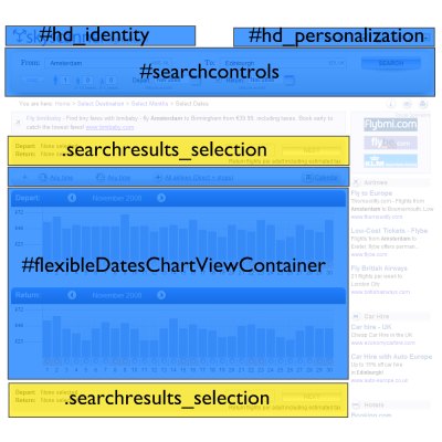
If a content block is designed to appear once on a page, we assign it a unique id. If it will appear multiple times, we give it a unique class. Each content block has its own CSS file:
- id_identity.css
- id_personalization.css
- id_searchcontrols.css
- class_searchresults_selection.css
- id_flexibleDatesChartViewContainer.css
- etc.
We have about 70 CSS files at the moment, each one handling the presentation of a very specific part of the site. Inside each CSS file, all of the rules are scoped to that specific id or class name. For example:
#hd_identity {
   float:left;
   height:40px;
   overflow:hidden;
   width:500px;
   }
   #hd_identity a {
      display:block;
	  height:100%;
	  padding:0;
	  margin:0;
   }
   #hd_identity.home {
      height:55px;
	  margin-bottom:20px;
	  margin-top:60px;
   }
The key benefit of this arrangement is that a developer can edit the CSS for a specific content block and be confident that their changes will not affect any other part of the site, because the rules are so narrowly scoped. This is very important when you want to split up work into streams that many developers can work on in parallel.
Depending on your perspective, however, you might see this as a huge drawback. One of the main benefits of CSS, after all, is supposed to be that you can apply visual changes to your whole site by changing a set of common rules. But when you’re working with a highly heterogeneous site with lots of differently styled content and controls, and you have multiple developers all making changes simultaneously, “common styles” are a minefield. You invariably end up with situations where Alice has ownership of feature A, but is reluctant to make changes to the common styles in case they have a knock-on effect on Bob’s feature B — so she adds a bunch of extra classes and exceptions to ensure that her changes stay isolated.
By using a highly modular CSS structure and a good build process, you are embracing that isolation. Most sites and projects spend most of their lifetime in maintenance mode, and a technique that helps reduce the potential for accidental errors when you’re making changes and bug fixes is a good thing.