I tweeted a question the other day about nesting <em> and <a> tags, to figure out which is better:
<em><a href="#">blah</a></em>or
<a href="#"><em>blah</em></a>Both are valid HTML, and browsers render them the same way. I’m also pretty sure that I’ve used them interchangeably in the past, and that I’ve asked myself the “which way is right?” question many times before. But enough! It’s time for me to have a definitive answer based on solid reasoning, not just an arbitrary decision, so that if I ever forget, I can retrace the logical steps and come to the same answer every time.
For me, the primary use case for nesting tags like this is to hyperlink book, film, or album titles. I wrap these titles in an <i> tag rather than an <em> tag. (See Oli Studholme’s article at HTML5 Doctor for an in-depth look at the semantic differences between the two.) Like so:
<a href="http://www.allmusic.com/album/clockwork-angels-mw0002332023"><i>Clockwork Angels</i></a>It was Vasilis who pointed out that the correct order of the nesting becomes immediately apparent if you add more text, only some of which belongs inside the inner tag:
<a href="http://us.macmillan.com/redshirts/JohnScalzi"><i>Redshirts</i> by John Scalzi</a>So that’s the answer: for linked titles (or ship names, or taxonomic designations), the link always goes on the outside.
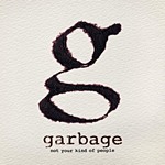 Garbage’s new album Not Your Kind Of People has seen a mixed reception: fans love it, but critics have generally gone “meh.” My own first impression of it was that even the heavy rock tracks like “Man On A Wire” felt pretty lightweight compared to their older material. It took me few listens to catch the flow of the album, and to get caught up in the hooks and grooves. There are some really good songs on there. “Blood For Poppies” has a bouncy sing-along chorus that belies its stark lyrics about war and battle. “Felt” has a throbbing drum and guitar backbone with the kind of melty vocals I find hard to resist. And “Automatic Systematic Habit” is a wicked synth-heavy opener that I would rate as one of their best ever songs, if it weren’t for how terrible and plain the first verse is compared to the tight interlocking slickness of the second.
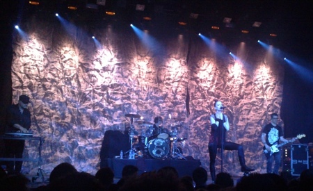
