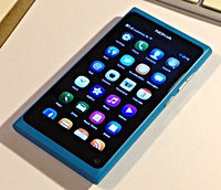
 I was lucky enough to win a Nokia N9 phone at the Mobilism conference last month. The N9 runs the MeeGo operating system, an ill-fated attempt by Nokia and Intel to build a Linux-based smartphone platform.
The N9 was announced shortly before Nokia decided to ditch Meego for Windows Phone, and it occupies a weird niche. It’s the only device Nokia intend to ever release with MeeGo on it, so it’s an obsolete phone on a dead-end platform. But the design of the phone was greeted so enthusiastically when it was announced that they could hardly not release it. Nokia seem embarrassed by the fact that despite almost non-existent marketing and limited availability, it has sold well and is very well liked. They have re-used almost exactly the same case design for the Lumia 800 Windows Phone, and the design heritage lives on in the Lumia line as a whole.
I love trying out different devices to get the feel of them, so I was absolutely delighted when out of all the different phones the sponsors had donated to Mobilism, it was the N9 that fell into my lap. Its minority status makes it highly attractive for checking out the far ends of the bell curve, but the fact that it’s quite pricey means I was unlikely to actually splash out on one myself. So I’ve definitely enjoyed walking around with it as my primary phone for the last month or two.
What I love about it:
- The case is gorgeous. The way the huge screen curves and blends with the all-in-one, high-density polycarbonate case is sleek and tactile. The cyan blue colour makes it stand out even more. Different is good.
- Double-tapping the screen to turn it on is very nice. I’ve totally got used to this; turning on other phones with a side or front button feels old-fashioned and clunky now.
- The full-screen MeeGo UI is terrific. Swiping all the way across the screen takes you to different views to take you to different views: apps, running apps, and notifications. The UI is sleek and responsive, and feels entirely in keeping with the case design.
- The web browser is pretty good. It doesn’t score as highly as Mobile Safari on html5test.com (284 vs 324), but it beats Android browser handily, and it feels pretty fast and smooth.
- The on-screen keyboard is pretty decent. Again, not as good as iOS, but an awful lot better than every Android keyboard I’ve come across.
- The notifications summary screen is nice, and I like the notification summary messages on the lock screen.
What I don’t like:
- Closing browser windows is a pain in the neck. This matters a lot for Twitter: when I click a link in a tweet, it opens in a new browser window. To close this window I have to: 1) Swipe left to bring up the list of running apps 2) Tap and hold the thumbnail of the browser window to enter “close screens” mode 3) Tap the X to close the window 4) Tap the “Done” button to leave “close screens” mode. 5) Tap the thumbnail of the Twitter window to return to Twitter. This is nuts. Part of the problem is down to the Twitter app shelling out to the native browser instead of using a webview within the app, but some of this is just the design of the OS. It drives me crazy.
- The Camera app is often, but not always, very slow to start. I mean slow to the point where it gives me the “Camera not responding – close application?” dialog. This is awful. I’ve tried rebooting, and even doing a complete factory reset, but it still happens.
- You can only enter landscape mode by rotating the phone 90 degrees anti-clockwise from portrait mode. This is a Nokia thing, I think — my C5-03 works the same way. Somewhat annoying, because I naturally turn phones the other direction to do landscape.
- Changing ringing volume, and switching to silent mode is fiddly. Switching to airplane mode should be more easily accessible.
- Subjectively, battery life feels very poor. I haven’t done precise measurements, but in standby mode (screen off), the battery seems to drain in just two days. Using GPS in the Maps application makes the device run really hot.
- Every now and then it just seems to forget about fetching/syncing email.
- The built-in Panorama app puts its photos in a non-standard location, which made me think that I had lost all the panorama shots I had taken with it. I met this with my usual swear-heavy mix of panic and anger.
- The Ovi Store is a bit of a sad mess.
Basically, there are a bunch of rough edges to the operating system. This is the point at which I was going to say, “But because MeeGo is dead, these problems will sadly never get fixed,” but that appears not to be entirely true! Just a couple of hours ago I happened to see Stuart Langridge mention a new N9 release on Twitter, and when I checked my N9 a few moments later, the “PR1.3” release of MeeGo appeared as an available update.
The release notes say that “This Nokia N9 update brings you many quality improvements,” so that’ll be nice. I wasn’t planning to change my primary phone for a wee while yet, so it’ll be interesting to see if this update addresses any of my problems. Even if it doesn’t, though, my verdict on the N9 is that it’s still a lovely device. It’s simply leagues ahead of most Android hardware out there, and I’d definitely rather have MeeGo than any version of the Android OS before 4.0/Ice Cream Sandwich. Above all, the N9 has got the classic Nokia cool factor. My very first mobile phone was a Nokia 7110, with the spring-loaded cover and navi-roller to scroll through WAP pages. That was a cool phone. The N9 is all that, for 2011. But, sadly, not 2012.

