A few months ago, Arjan Eising (@arjaneising) tweeted a quick poll about CSS formatting:
CSS Poll: do you place your CSS properties on one line per selector (compact), or do you use one line per CSS property (expanded)?
To put it another way, expanded is:
.monkey {
    background:#fff url(/images/monkey-bg.png) repeat-x 0 0;
    border:1px solid #fde;
    display:block;
    font-size:123.1%;
    margin:1em;
    text-transform:uppercase;
}
compact is:
.monkey {background:#fff url(/images/monkey-bg.png) repeat-x 0 0;border:1px solid #fde;display:block;font-size:123.1%;margin:1em;text-transform:uppercase;}I replied:
Expanded. Compact only works if you’re the only person maintaining it & don’t use source control. Otherwise, it’s stupid.
Now, I feel the need to defend this statement, because “stupid” is an emotive word, and it’s not one I use lightly. The nicest thing a colleague has ever said about me was that I “express strong opinions without threatening to break your fingers,” and calling something “stupid” is about as close to violence as I get. (Unless you get me started on RyanAir…but that’s another story.)
The first thing to notice about my comment is that it’s qualified: if you are the only person working on your CSS code, and you don’t use source control, then fine. Knock yourself out. Write the code however you want. Use single-letter class names for all I care. (Because they’re shorter and save bytes! But only lowercase single-letters because they compress better!) They key point is: you’re not harming anyone else.
But: if you use source control, that shows you care about before and after and the ability to keep a history of what’s going on with your code. Source control is all about changes between once version and the next, and no matter whether you are using a side-by-side or inline viewer to see the differences between two revisions, a shorter line length makes it easier to visually identify those differences.
Viewing differences becomes even more important as soon as there is more than one person working on the code, because you will be looking at the changes that other people make. The change between two revisions can often give you more information about the reason for a change than the new code can give you on its own. When it comes to maintaining a piece of software over a non-trivial lifetime, change tracking is vital to understanding both the codebase itself, and the underlying (business) requirements.
See, it’s not the readability of long lines in themselves that I question (research is vague, but I’m comfortable saying that 200-character lines help no-one); I’m more concerned about the secondary problem of being able to manage and understand changes in those lines over the long term and/or in a coding environment where you’re not the only contributor.
The best way to do this is to write each property on a single line. Writing single-line CSS rules harms maintainability, which is a bad thing. There is no technical reason to prefer compact CSS over expanded CSS (rule 1 applies to CSS as well as JavaScript), so the reason for writing single-line CSS is a personal preference. In my mind, it’s up there with smoking.
Okay, maybe not that bad. Most CSS won’t give you cancer. But I’m going to stick to my original assessment of “stupid”. I won’t break your fingers, but I will swear a lot while reading your code.
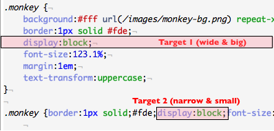
That said, there is an editability (as opposed to readability) argument to be made against long lines as well. This comes down to Fitts’ Law: if each property is on its own separate line, when you want to hit that property with your mouse pointer, you’re aiming for a much wider target than if the property is nestled somewhere in the middle of a single long line, as shown in the image below:

And if you prefer to use the keyboard, it takes fewer keystrokes to navigate and manipulate multi-line CSS than the single line versions. (Unless, of course, you use emacs, in which case there’s probably already a command to insert all those border-radius properties you wanted you to add.)
Version control with a single line CSS file is a hell. I prefer the expanded version as well, and I’m even a die hard who places the properties in alphabetical order.
I do alphabetical order as well. It’s a good idea because it reduces the risk of bugs caused by having the same property defined twice in a large rule. If they’re sorted alphabetically, they’re going to be on adjacent lines, and they will stand out more.
Totally OT, but was not able to comment under older post (http://sunpig.com/martin/archives/2004/09/10/dutch-train-station-clocks.html) – so feel free to remove, reformat or whatever.
There are several benefits of the stop at full minute – one: it allows easier synchronisation between clocks as it gives a more distinctive time point on which to synchronise. It works well with automatic electric synchronisers (and helps to avoid the need to set the clock back at any time during normal operation) and it also helps to synchronise people – trains are supposed to be started exactly when the minute hand jumps and the stop gives you preparation time – and this is not subjective, it actually helps.
This design has a name – it is called stop-to-go. AFAIK, the design is Swiss – from official railroad watchmaker – Mondaine. (http://www.timetechnoinc.com/mondaine-stop-go)
+1 for sorting alphabetically. i would also suggest every entry should be used. a quick scrub of the stylesheet to delete unused classes does wonders for maintainability.
Thanks. You helped me- a lot!