Marching ants in CSS

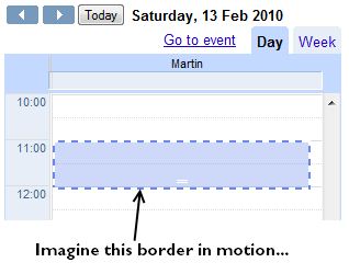
A couple of days ago I noticed that Goooogle uses a marching ants effect on their new mini-calendar event view. It highlights the target time frame for the event you’re editing, and it indicates a draggable and expandable area. (It’s probably been there for ages, but I’m slow like that.)

Marching ants effect in Google Calendar.

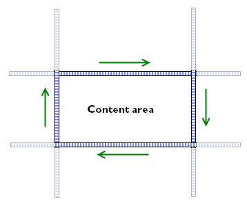
Being a colossal geek, the first thing I did was run up Firebug to see how they’re doing it, because there is no “border-style: marchingants” in CSS. It looks like Google is doing it with JavaScript. The area in question is bounded by four long but thin div elements (tall and narrow for the vertical borders, short and wide for the horizontal borders).

<div class="sc-ants sc-ants-top"></div>
<div class="sc-ants sc-ants-left"></div>
<div class="sc-ants sc-ants-right"></div>
...
<div class="sc-ants sc-ants-bottom"></div>

These divs sit inside a parent container with overflow:hidden, so you only see a small slice of their full extent. The border divs themselves have size, but no content. Their entire area is taken up by a 2px-wide dashed border:

.sc-ants-top  {
    border-top:2px dashed #6688EE;
    height:0;
    top:0;
    width:10000px;
}

Finally, there is a JavaScript timer that changes the position of these divs, moving them a pixel at a time to achieve the marching ants effect.

Even in native applications, marching ants are not all that common, and I think this is the first time I've seen them in a web application. Given that draggable/resizeable areas are also not all that common in web apps, I think it's a clever and elegant way of highlighting that there is something different an unusual about that area.

On the other hand, I'm not mad keen on keeping JavaScript timers running just to keep screen elements in their appropriate position, so I wondered if there was a way of doing this with just CSS instead. And of course there is: have a look at the demo page.

I started with a block of HTML in the standard module format, because it's a good basis for isolating areas of content. The div.bd holds the actual content to be highlighted, and the other parts of the module are used for creating the borders, as follows:

  • The outermost div is given a left-hand pseudo-border by using a background image with repeat-y only, positioned slightly to the left of the left edge, so that only the rightmost two pixels of the image are visible.
  • Likewise, the .inner container is given a top pseudo-border.
  • The .hd block makes the right-hand border. It is positioned absolutely on the right edge of the module, 2px wide and 100% tall, and has a background image with repeat-y.
  • The .ft block makes the bottom border. It is 2px tall and 100% wide, and also has a background image.

Here's how it looks inline:

Marching ants!

The actual animation is achieved with a couple of old-skool animated GIFs, ants-horizontal.gif and ants-vertical.gif. The horizontal GIF contains two checkerboard patterns, one moving to the left, and one moving to the right; the vertical GIF has the checkerboard patterns moving up and down. Each border only uses half of one of the GIFs, which is you only need two images rather than four.

If you are content with the border being a single pixel thick, and the ants flowing from one corner to the opposite, then you could get away with just one animated GIF — see the wikipedia article on marching ants for an illustration. Personally, I prefer the animation to flow round the border in a continuous pattern.

Of course, this is far from the only way you could implement the marching ants effect. You could use webkit's CSS animations instead. The demo page includes an example of how to do this as well. The basic principles are exactly the same: set up a standard module, and use GIF images to form the necessary borders. But instead of using animated GIFs, you can use just a single static checkerboard image, and use up/down/left/right animations to move around the background instead:

.marchingants {
	-webkit-animation-name: march-up;
	-webkit-animation-duration: 0.3s;
	-webkit-animation-iteration-count: infinite;
	-webkit-animation-timing-function: linear;
}
@-webkit-keyframes march-up {
	from {
		background-position-y: 8px;
	}
	to {
		background-position-y: 0;
	}
}

One neat thing about the CSS animation version is that you can vary the speed of the animation without having to edit the GIF file. The obvious drawback is that it (for now) only webkit browsers support CSS animations. But given how easy it is to implement this in a cross-browser compatible manner, right now I'd suggest sticking to the animated GIF version.

Geeknotes 20081116: The Unistable Polyhedron edition

(Note: this entry was originally published on the Skyscanner Geeks blog.)

CSS, Typography, Design, User Experience

Coding

Threading, Scaling, Clouds

Other Geekery

  • For those times when you want to talk about your shiny new idea but are worried that your buddy might nick it, Rands delivers the FriendDA.
  • A unistable (or monostable) polyhedron is a shape that will only balance on one of its faces (assuming uniform density). The unistable polyhedron with the fewest known faces is shown below. See notes at Wolfram Mathworld and the Mathematical Association of America. (Via the Risks Digest.)

unistable-polyhedron.png

Maintainable CSS: modular to the max!

(Note: this entry was originally published on the Skyscanner Geeks blog.)

In recent years, the issue of getting developers to write CSS in the first place has been one of the big issues facing web standards evangelists β€” hence the enormous number of articles you’ll find around the web about CSS basics, and techniques to achieve specific visual results. Designers like Dave Shea and Andy Clarke (and many others) have helped us push the boundaries of what is considered possible with HTML and CSS. And although far from all problems are solved (think: multi-column lists), you can usually google around and come up with a recipe to achieve most of the everyday effects that people have come to expect circa 2008.

But putting together a snippet of CSS to give a block of text a background gradient and rounded corners is not the same as building the styles for a dynamic site designed to evolve over the course of several years, and to be worked on by many people in parallel. As Natalie Downe said in her recent presentation at BarCamp London, this is not a solved problem. In many ways, CSS is like regular expressions: much easier to write than to read.

There are many useful techniques for making CSS more readable. Two of my favourites are indenting selectors to indicate element hierarchy or specificity, and keeping the rules in a consistent (e.g alphabetical) order. For example:

div.monkey {
   border:1px solid #99f;
   margin:2em;
   padding:0.5em;
   position:relative;
   }
   div.monkey div.fez {
      background-color:#eef;
      color:#003;
      position:absolute;
      width:200px;
      }
      div.monkey div.fez label {
         font-size:1.2em;
         left:0;
         }
         div.monkey div.fez label.waistcoat {
            left:100px;
            }
      div.monkey div.fez input {
         padding:0.2em;
         }

However, readability is only the first step towards maintainability. No matter how you comment, indent, or structure your CSS, if you jam all your declarations into a single “main.css” file, you’re still doing it wrong.

In his presentation at Fronteers 2008, Stephen Hay discussed separating a site’s CSS into three different files, one to define layout, one for colour, and one for typography. This is not an uncommon approach. Mike Stenhouse calls it modular CSS, and Jeff Croft talked about it in the ALA article Frameworks for Designers. These approaches recognize that it’s madness to keep all your styles in a single file, but they all want to keep the number of CSS files small.

But in cases where you’re working with larger teams of designers or developers, I think this is wrong, and may actually harm maintainability. When you’re working with larger teams, you should be using more files, not fewer. Once you have taken the small step of moving your styles out of a single file and into three, four, or five thematic files, the next big leap is to take that modularity to the max, and create ten, twenty, or more .css files!

But what about performance!? Haven’t we all learned to minimize HTTP requests?

The key to making this work is a build process. A build process allows you to separate your development code (the files you work with) from the machine code that gets served to a browser. Christian Heilmann has been evangelizing this for ages, and almost exactly the same techniques apply to CSS as well as JavaScript.

Development code is what you read and write, and check in to your source control system. It should be highly modular (split over many files), extensively commented, and should make liberal use of whitespace to indicate structure.Machine code is what gets served up to a browser. It should consist of a small number of merged files, and should be stripped of comments and unnecessary whitespace. Your build process is the mechanism with which you apply these transformations. Finally, your web server should deliver the machine code with gzip compression for extra speediness.

Development code is for humans, machine code is for machines. It’s humans who will be maintaining your code.

So what humans see is a large number of files (potentially organized into multiple folders):

  • reset.css
  • grids.css
  • fonts.css
  • headers.css
  • header_navigation.css
  • footer_navigation.css
  • top_adverts.css
  • forms.css
  • etc.

In the olden days, you would bring all of these files together with a bridging file, with @import rules to reference them all. Don’t do that, because each @import rule causes another HTTP request. Use your build process to stitch the files together into a single file (“merged_styles.css”), and serve that instead. Alternatively, you can use a script to do the merging on the fly: Cal Henderson’s article Serving JavaScript Fast describes how to do this.

How you split up your CSS files is up to you, of course. Here at Skyscanner, we use the basic YUI CSS core (rest, fonts, grids) to apply a common baseline to all pages. The content that goes onto the pages is then separated into major blocks, each of which has a very specific ID or class name:

skyscannercss.jpg

If a content block is designed to appear once on a page, we assign it a unique id. If it will appear multiple times, we give it a unique class. Each content block has its own CSS file:

  • id_identity.css
  • id_personalization.css
  • id_searchcontrols.css
  • class_searchresults_selection.css
  • id_flexibleDatesChartViewContainer.css
  • etc.

We have about 70 CSS files at the moment, each one handling the presentation of a very specific part of the site. Inside each CSS file, all of the rules are scoped to that specific id or class name. For example:

#hd_identity {
   float:left;
   height:40px;
   overflow:hidden;
   width:500px;
   }
   #hd_identity a {
      display:block;
	  height:100%;
	  padding:0;
	  margin:0;
   }
   #hd_identity.home {
      height:55px;
	  margin-bottom:20px;
	  margin-top:60px;
   }

The key benefit of this arrangement is that a developer can edit the CSS for a specific content block and be confident that their changes will not affect any other part of the site, because the rules are so narrowly scoped. This is very important when you want to split up work into streams that many developers can work on in parallel.

Depending on your perspective, however, you might see this as a huge drawback. One of the main benefits of CSS, after all, is supposed to be that you can apply visual changes to your whole site by changing a set of common rules. But when you’re working with a highly heterogeneous site with lots of differently styled content and controls, and you have multiple developers all making changes simultaneously, “common styles” are a minefield. You invariably end up with situations where Alice has ownership of feature A, but is reluctant to make changes to the common styles in case they have a knock-on effect on Bob’s feature B β€” so she adds a bunch of extra classes and exceptions to ensure that her changes stay isolated.

By using a highly modular CSS structure and a good build process, you are embracing that isolation. Most sites and projects spend most of their lifetime in maintenance mode, and a technique that helps reduce the potential for accidental errors when you’re making changes and bug fixes is a good thing.

The double-padding/nowrap bug: how to make IE6 hit 100% CPU usage with some simple HTML + CSS

I came across an amusing bug in IE6 last week. The existence of a bug in IE is no great surprise, but the way it manifests itself is quite interesting: with just a tiny bit of HTML and CSS, you can cause IE’s CPU usage to spike up to 100% and stay there, slowly leaking away memory. It seems unlikely that this has never been seen before, (especially as it doesn’t occur in the IE7 beta), but I couldn’t find a reference to it anywhere on the web, so I’m posting it here.

It starts off with a simple piece of HTML:

<!DOCTYPE HTML PUBLIC "-//W3C//DTD HTML 4.01//EN"
            "http://www.w3.org/TR/html4/strict.dtd"><html>
<head>
   <title>IE6 100% CPU test page</title>
</head>

<body>
   <table>
      <tr>
         <td>
            <p><span class="test">abcd efgh ijkl mnop</span></p>
         </td>
      </tr>
   </table>
</body>
</html>

Especially in table-based layouts, it’s not unusual to see a span wrapped in a p wrapped in a table cell. The problem kicks in, though, when you apply the following CSS:

<style type="text/css">
   p {
      padding:0.5em;
      position:relative;
      white-space:nowrap;
   }
   span.test {
      padding:1em;
   }
</style>

Setting the position of the p is potentially unusual, and you might wonder why the white-space:nowrap is being applied to the paragraph rather than the span, but at least on the surface, it all looks kosher. Nuh-uh.

I’ve set up a test page with exactly this code in it. Try using IE6 to visit it. Does everything seem to be working as normal? How about if you try resizing your window to narrow it down…and down…until it’s just wide enough to hold the text. Oh no! It’s dead. Poor IE.

Now imagine the text in the cell being wider, or the table having several of those cells in a row, so that even at a normal window size the CPU usage spikes as soon as you load the page. Major bumcraft. This was a pig to track down and debug.

But even having reduced the problem to a simple test case, I’m still not sure why this should go wrong. It looks like IE’s rendering model is unable to resolve a circular reference between the p and the span when the forced width of the nowrap and the added paddings interact. But beyond that…mmmidunno. As always, it pays to be on your guard when dealing with IE and padding.

Update (20 Feb 2006): After playing around with this bug a bit more, I’ve found that it’s even worse than I’d first described. You don’t even need the p to be embedded in a table cell to bring IE down. Using the same CSS as above, the following HTML is sufficient (example 2):

<!DOCTYPE HTML PUBLIC "-//W3C//DTD HTML 4.01//EN"
            "http://www.w3.org/TR/html4/strict.dtd"><html>
<head>
   <title>IE6 100% CPU test page</title>
</head>

<body>
   <p><span class="test">abcd efgh ijkl mnop</span></p>
</body>
</html>

You don’t even have to use a p and a nested span, either. Although I haven’t tested every possible combination, it looks like any inline element nested within a block-level element shows the same behaviour, e.g. an em within a h3 or an a inside a div. If you nest a block-level element inside another block (e.g. a p inside a div, everything’s fine.

What’s even more amusing is if you remove the DTD from the HTML above, and watch what happens (example 3). IE still goes to 100% cpu, but it retains just enough spare capacity to refresh its display. This time, if you narrow the window down, the text disappears, and the window’s vertical scrollbar makes it look like the page has got enormously tall. But if you try scrolling up and down, the content is nowhere to be found. If fact, it looks like IE is still trying to figure out where the content should go, too: if you scroll part-way down the (blank) page, you’ll notice the scroll block jumping up and down like a confused monkey.

But then if you try to widen the window back to its original size, it freezes up completely again.

And yes, it also works if you place the style definitions inline, rather than in a <style> block (example 4):

<html>
<head>
   <title>IE6 100% CPU test page</title>
</head>

<body>
      <p style="padding:0.5em;position:relative;white-space:nowrap"><a style="padding:0.3em" 
href="http://www.example.com">abcd efgh ijkl mnop.</a></p>
</body>
</html>

If you needed another reason why it’s a really bad idea to allow visitors to use HTML in your blog comments section, well, there you go.

Wiggle stereoscopy, follow-up

Almost immediately after putting up my posting about Wiggle stereoscopy with Javascript, I got reports of funny behaviour with Internet Explorer. I can’t say this came as a great surprise.

To recap on the technique, the core idea was to:

  1. replace a composite image with a <div> of a fixed size,
  2. set the background-image of this div to be the same as the replaced image, and
  3. flip the position of the background image every 120ms

Replacing the composite image with a div

Toggling the background image position

You can see the original script in action in Example 1.

The problem lies with the way Internet Explorer handles CSS background images. If IE’s cache settings are at their least forgiving (i.e. check for newer versions of stored pages “Every visit to the page”), changing the background-position of the background image causes IE to requery the web server for the image in question. The answer will generally be “HTTP 304: Not Modified”, so at least it doesn’t re-download the image again, but there’s a good chance that 120ms (the flicker rate) is not long enough for the server round-trip to complete. Result: IE spends all of its time checking for a new version of the image, and no time at all actually displaying anything.

Internet Explorer set to check for a newer version of a page on every visit

This problem is comprehensively documented at FiveSevenSix.com. There is a workaround involving server settings, but that goes against my desire for a keeping the technique nice and simple to implement. Alternatively, I could probably have used a variant of the double-buffering technique to fix it. But upon reflection I wondered if it was worth using background images at all.

Background images are perfect if you want to transform a piece of naked markup (like a <ul> list) into something graphically pleasing. But the wiggle technique is specifically designed to animate an existing in-line image. So: the new version of the script (1.1) does the following:

  1. It wraps a <div> around the <img>,
  2. sets the overflow property of the <div> to hidden, so that the excess parts of the image are masked off, and
  3. changes to position of the <img> itself every 120ms.

Example 2 is running with version 1.1 of the script.

Another problem that the original wiggle script had was that even with IE’s cache settings at a more normal level, it interfered with the mouse hovering over any hyperlinks in the same page: the hand cursor would change immediately back to an arrow, and in some configurations the url of the hovered link would also instantly disappear from the status bar. Version 1.1 fixes this, too.